The Temporal War is a board game created by Infinity Fiction LLC. The game is a cross between a dice-battler and a trading card game. I was hired as the lead artist on the project and not only was tasked with over 70 illustrations, many card design passes for 7 different card types, creating the logo and icons for each faction and each stat, the design for the board, the box, and tokens, I was also responsible as the lead to ensure the other artist’s work was up to par and ready to be shipped.
Below I have laid out my entire work on the project, so please take a look at my accomplishments and hopefully you can take away some information that will assist you with any of your own projects that you may have yourself! I have worked really hard on this and the game needs support from people like you to fully flourish, so definitely check out the site below!
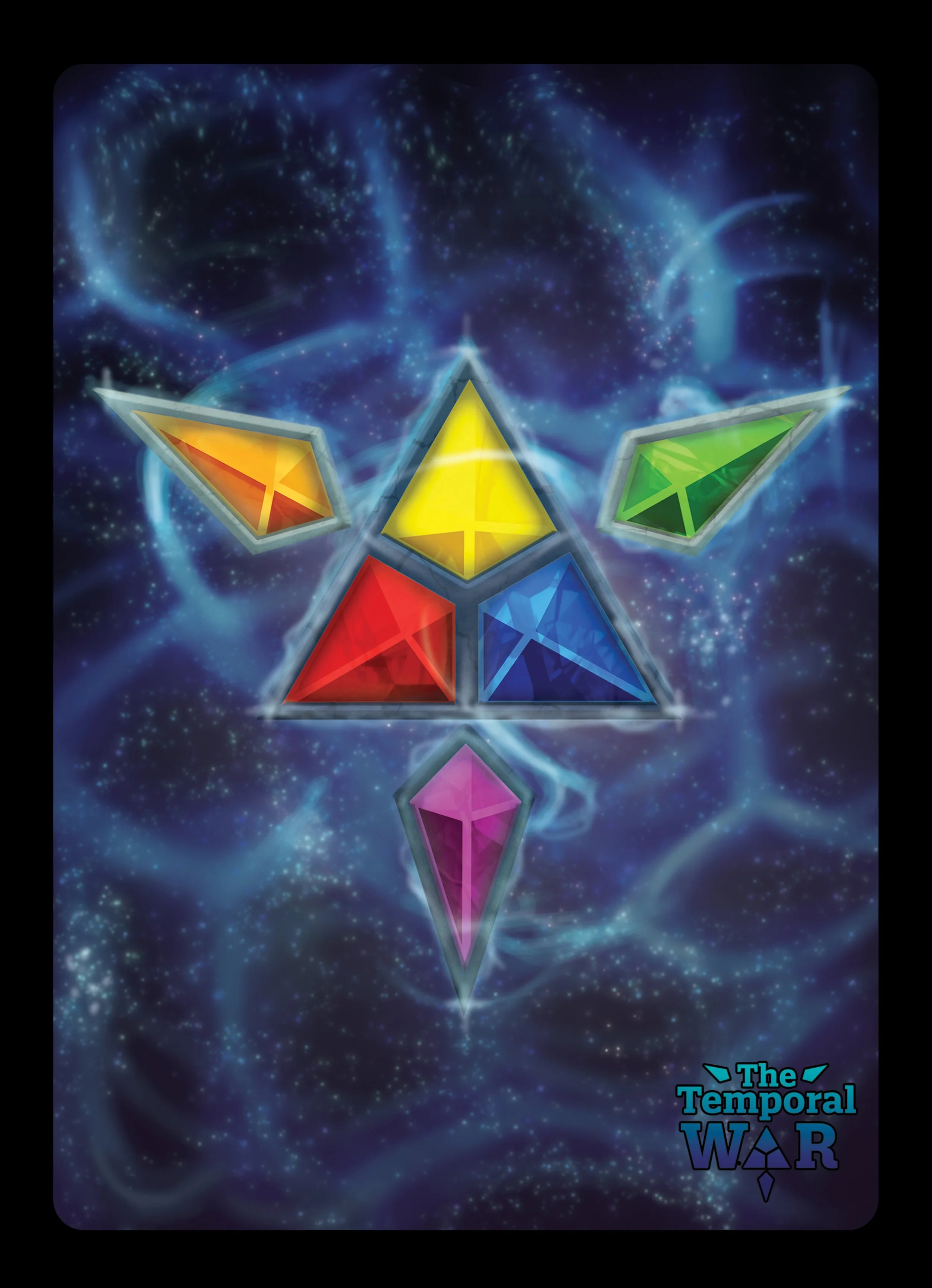
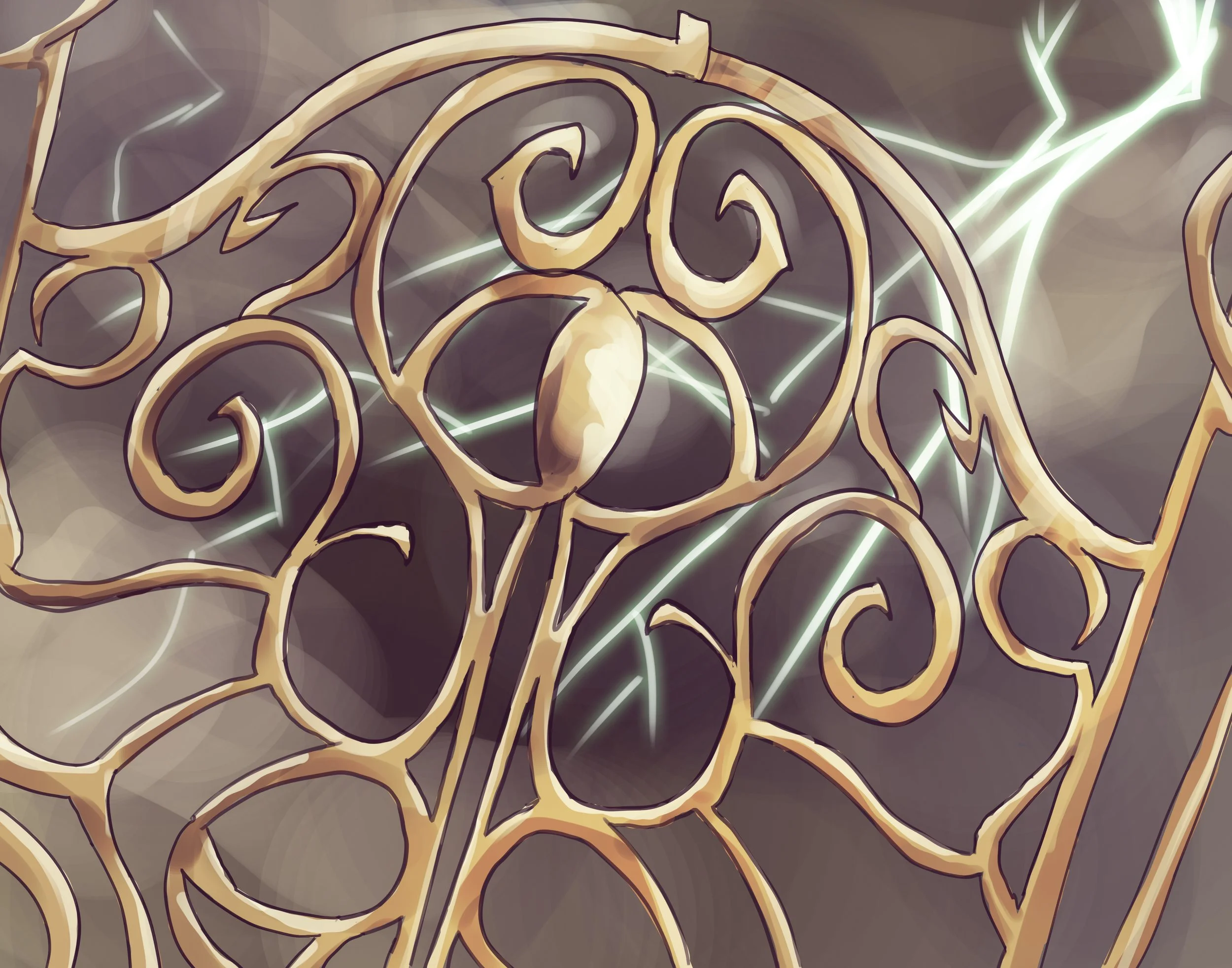
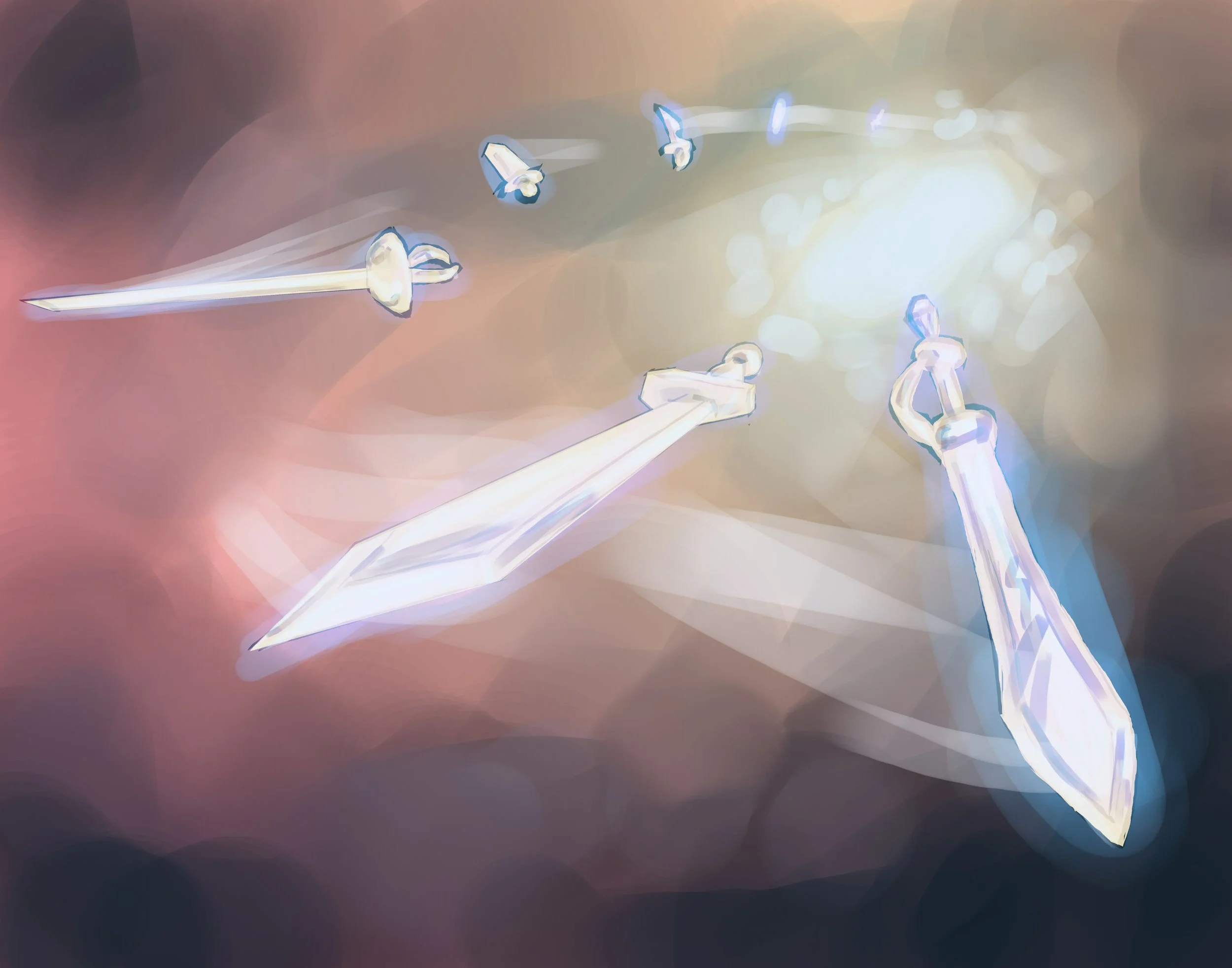
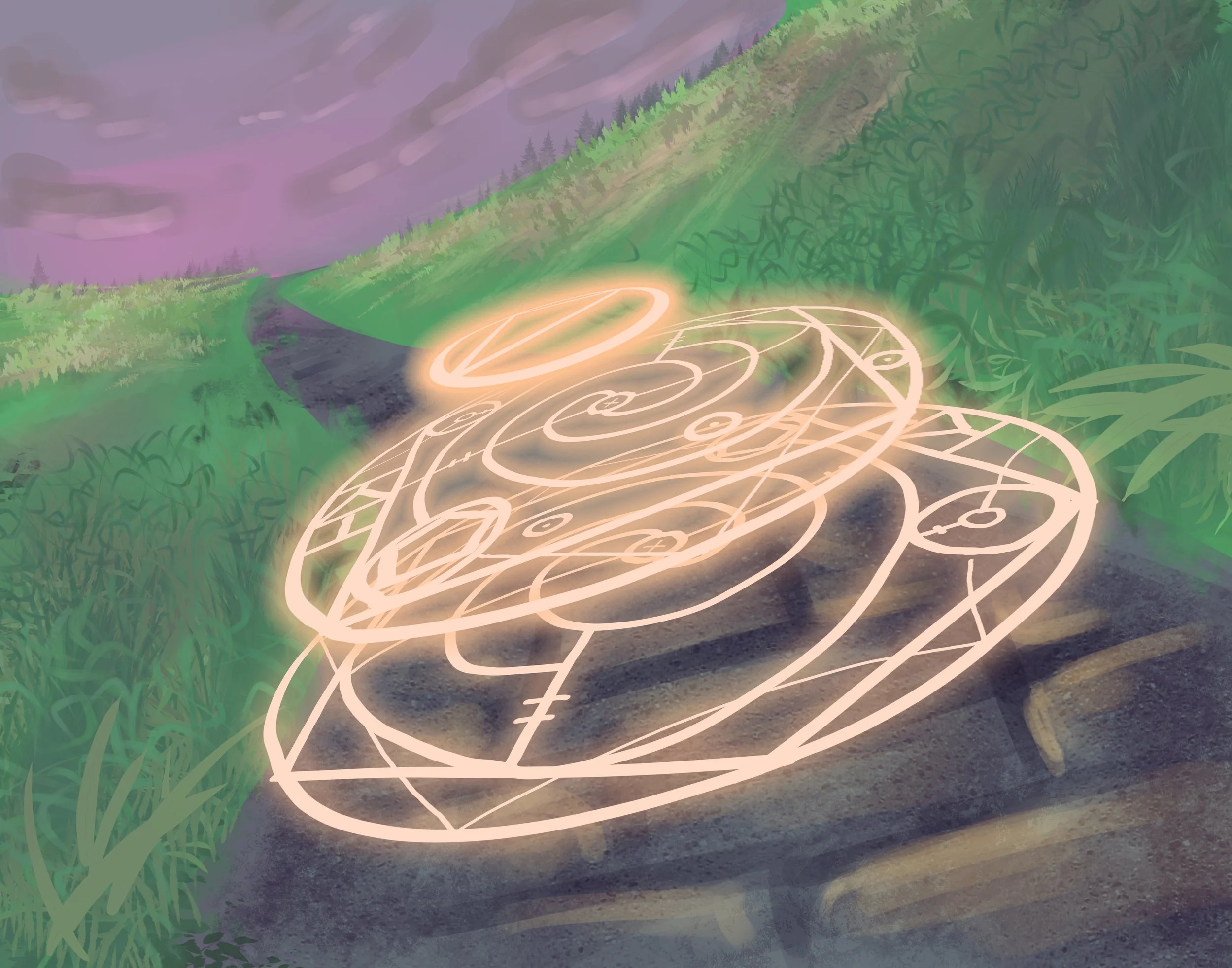
The first part of this project was of course, to create the logo. The logo is representative of the
6 crystals in the game that serve as gateways to the battleground; 1 for each faction. I used the strength of rotational symmetry and pointers to create a visually interesting design while meeting the criteria of my client.
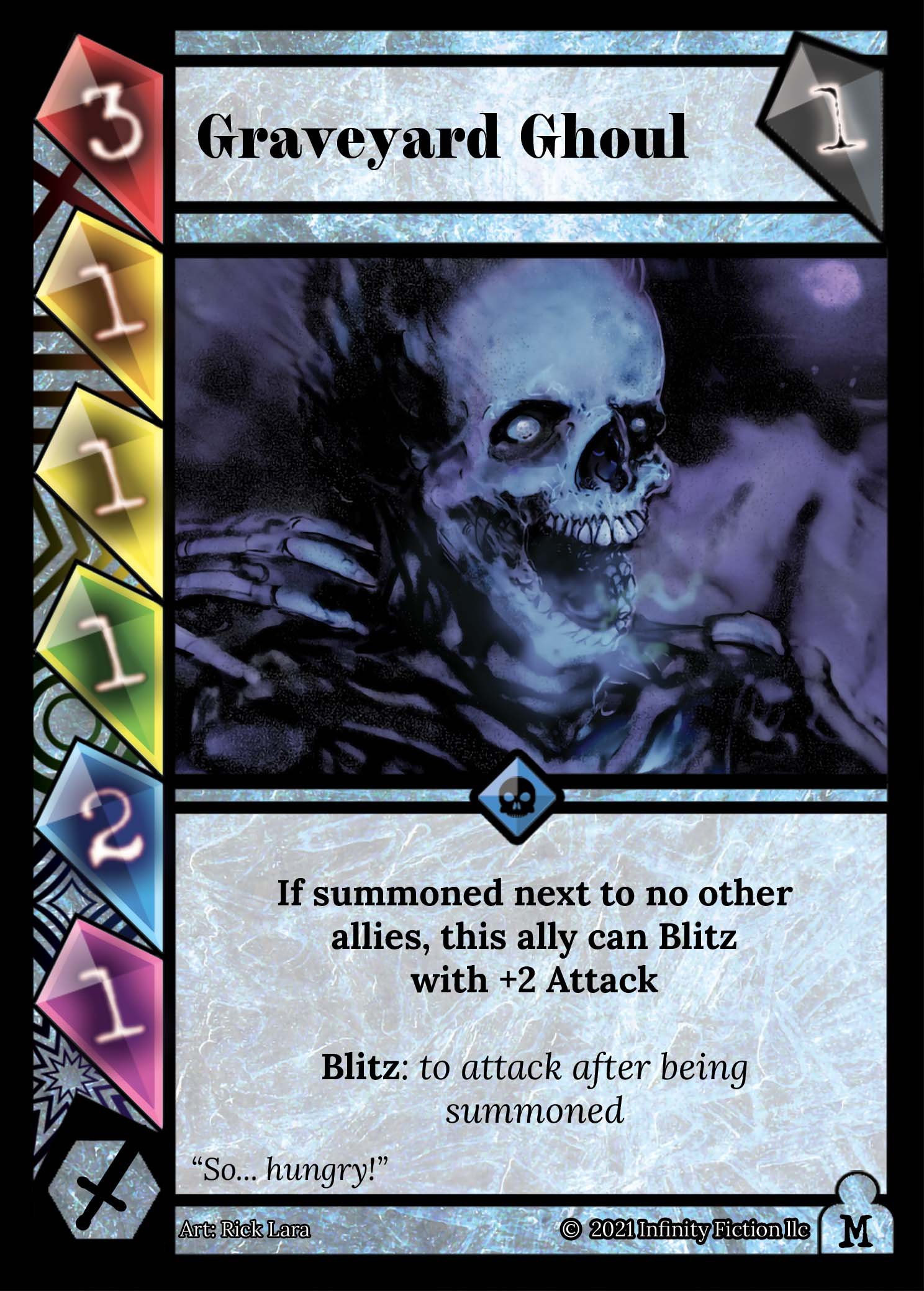
Next, came the card design. This was the original card design, which incorporated the crystals even further in the design. One crystal per-stat with abstract symbols underneath to help identify each stat. This design didn’t work for a number of reasons. One being that it wasn’t very clear which stat was which, and another being that it forces the illustration to be much smaller than a standard card art size.
The second design, however, was much more successful for readability. Still implementing the crystal concept, I crafted crystalline symbols to correspond with each stat. One of the stats was also nixed in developments, leaving 5 instead, which really helped give more breathing room to the design. The warrior class symbol and size symbol (in the bottom left and right respectively of the old design) was also removed, but in it’s place came the rarity symbol at the bottom of the card. Overall, I think the first design was way more visually appealing, but the second was way more practical and readable, so this is the design that stuck and I think it looks clean!
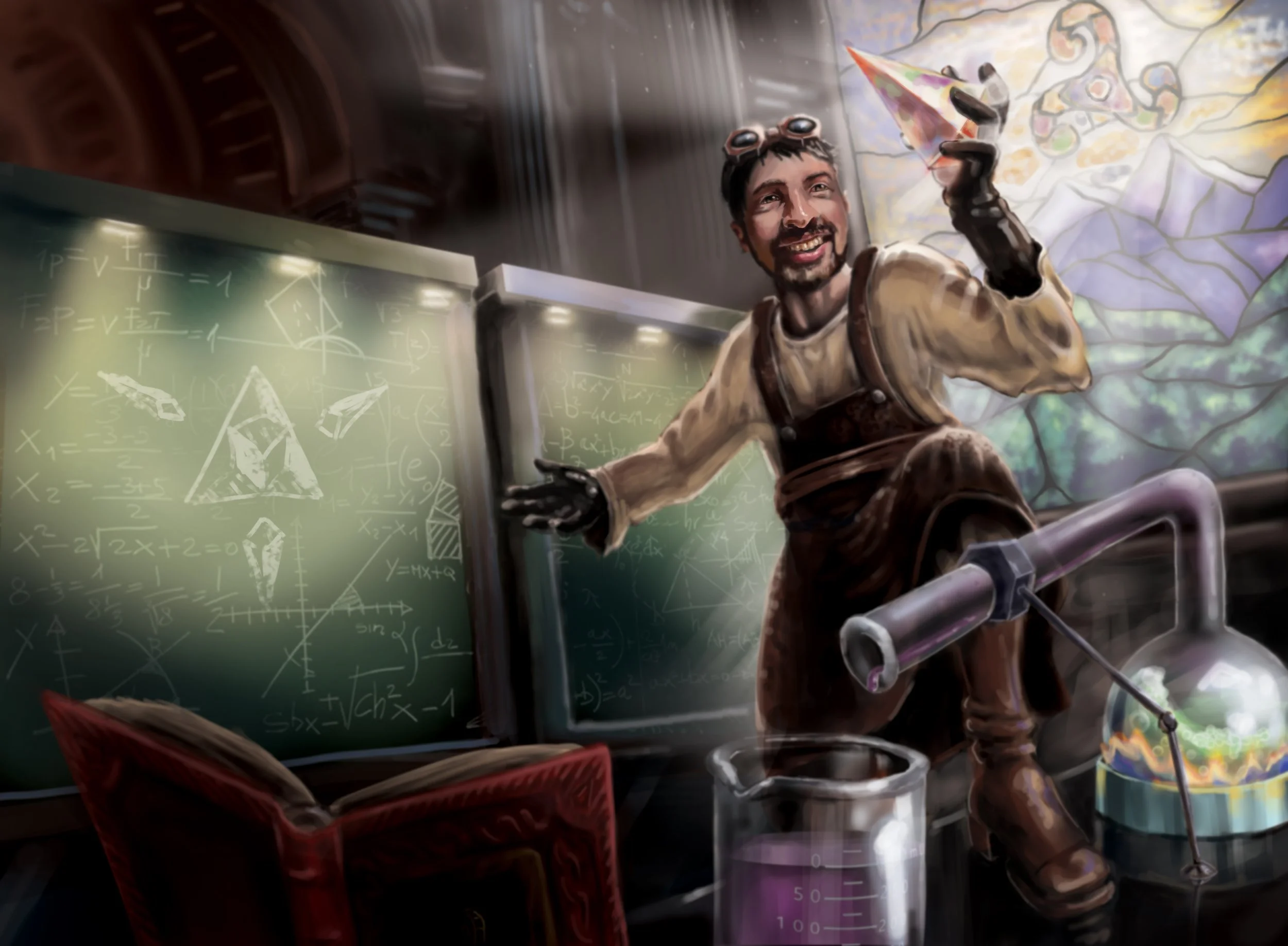
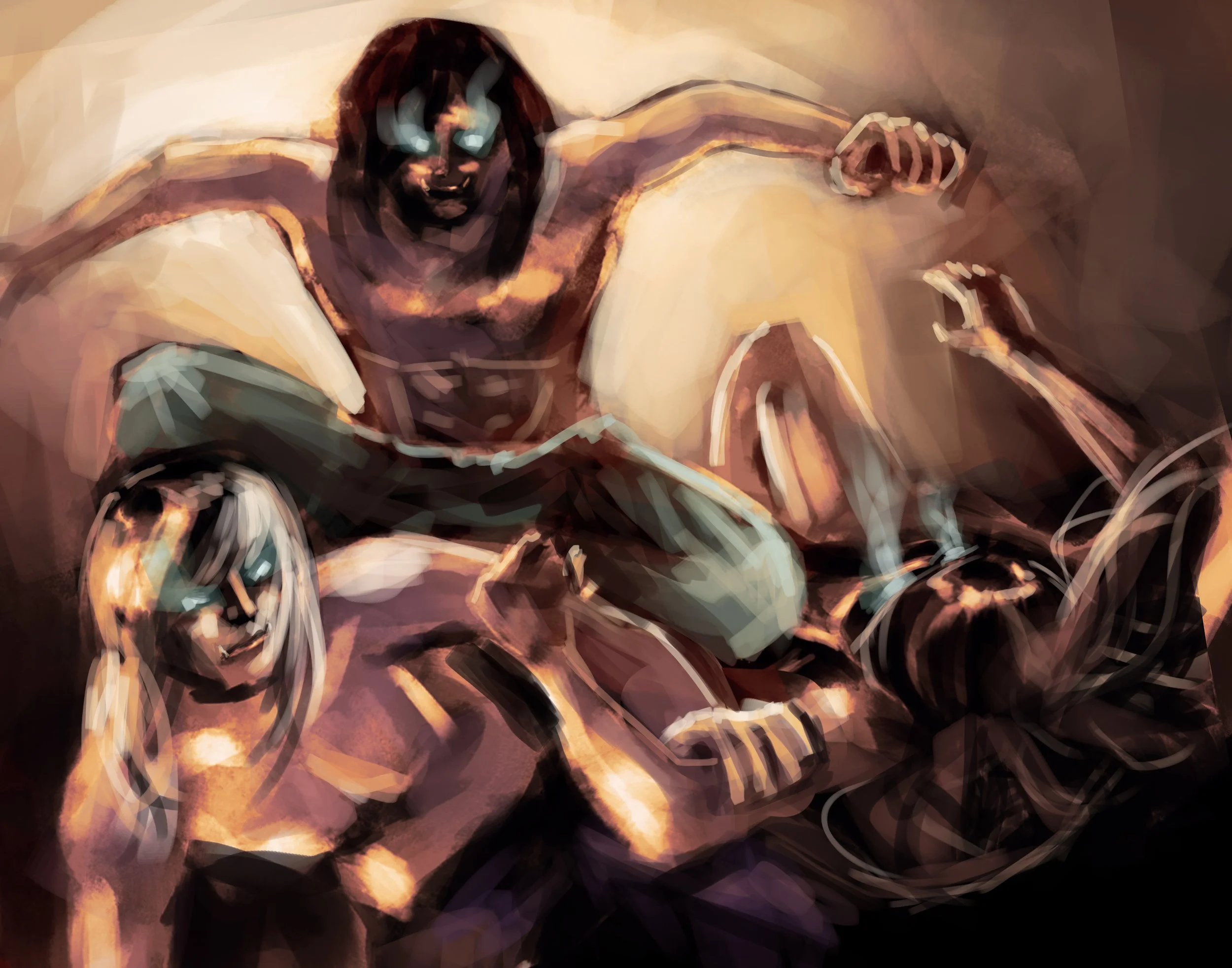
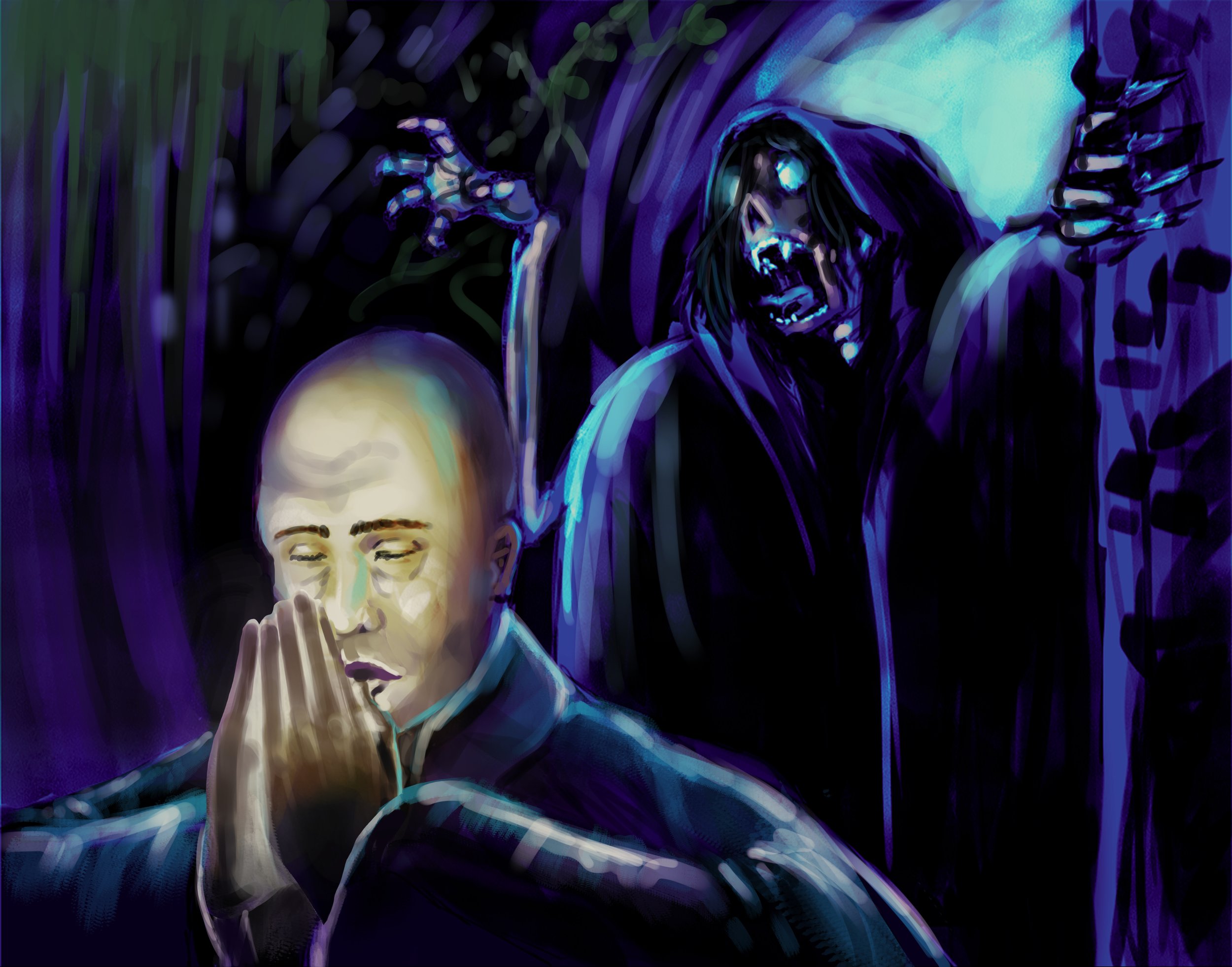
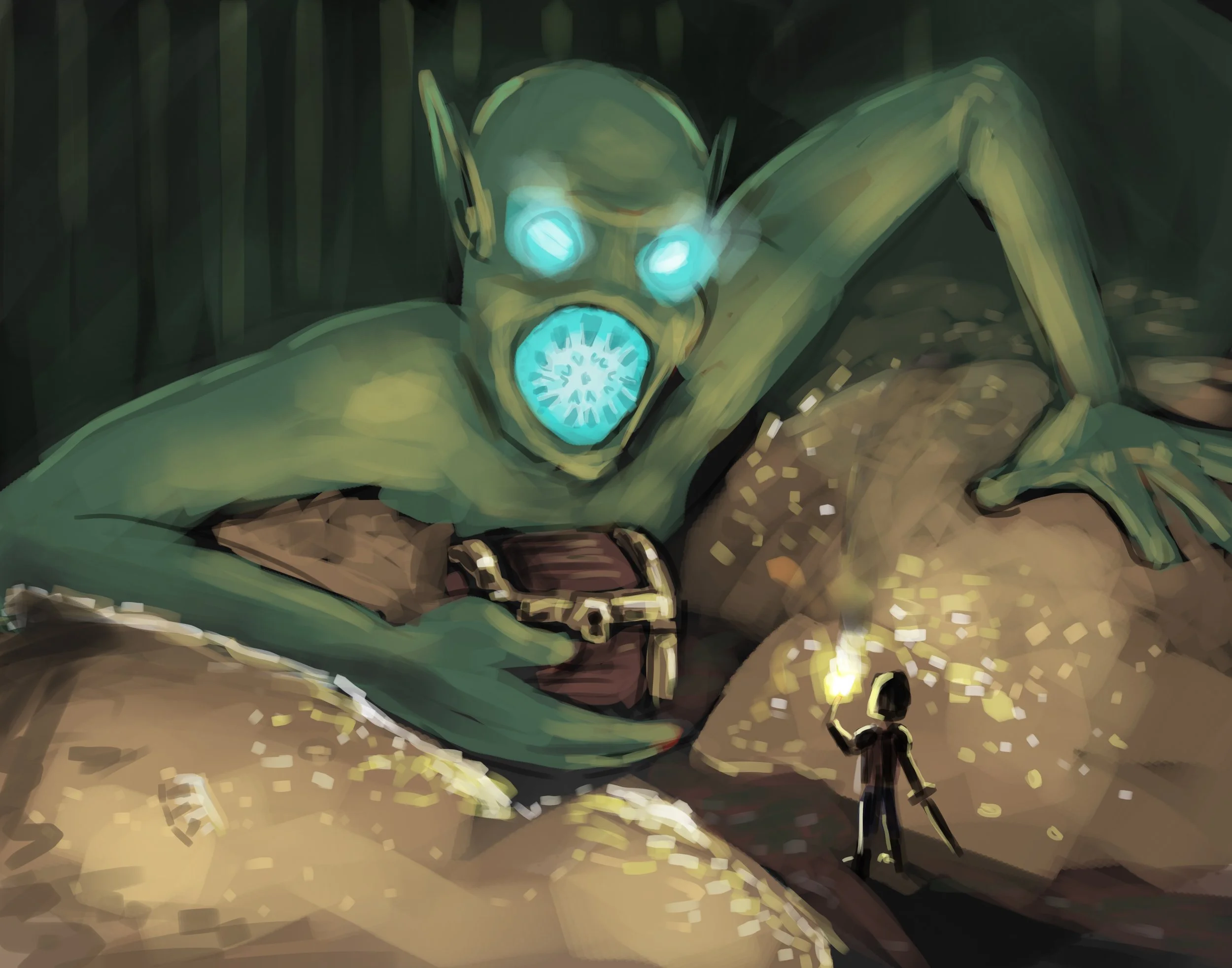
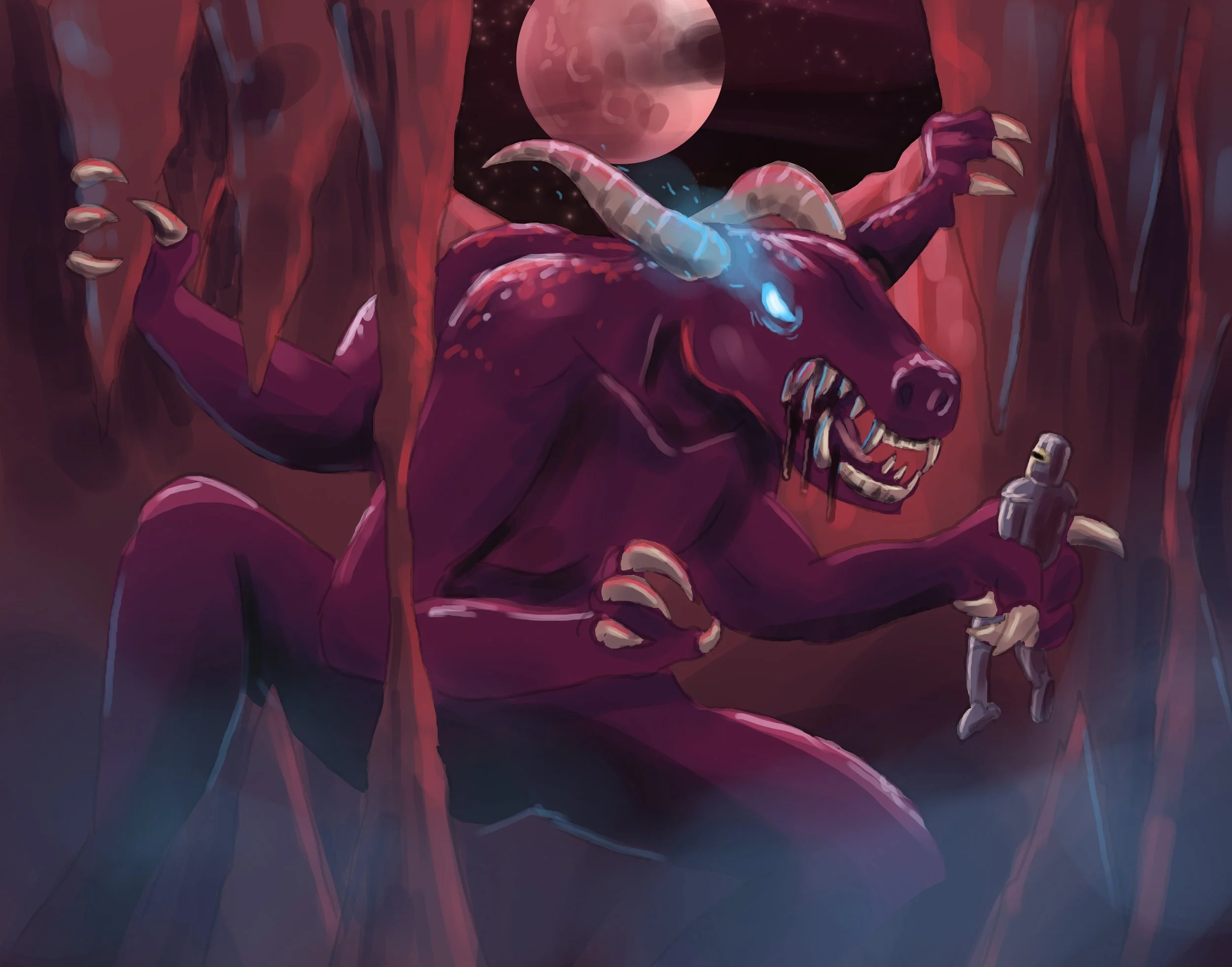
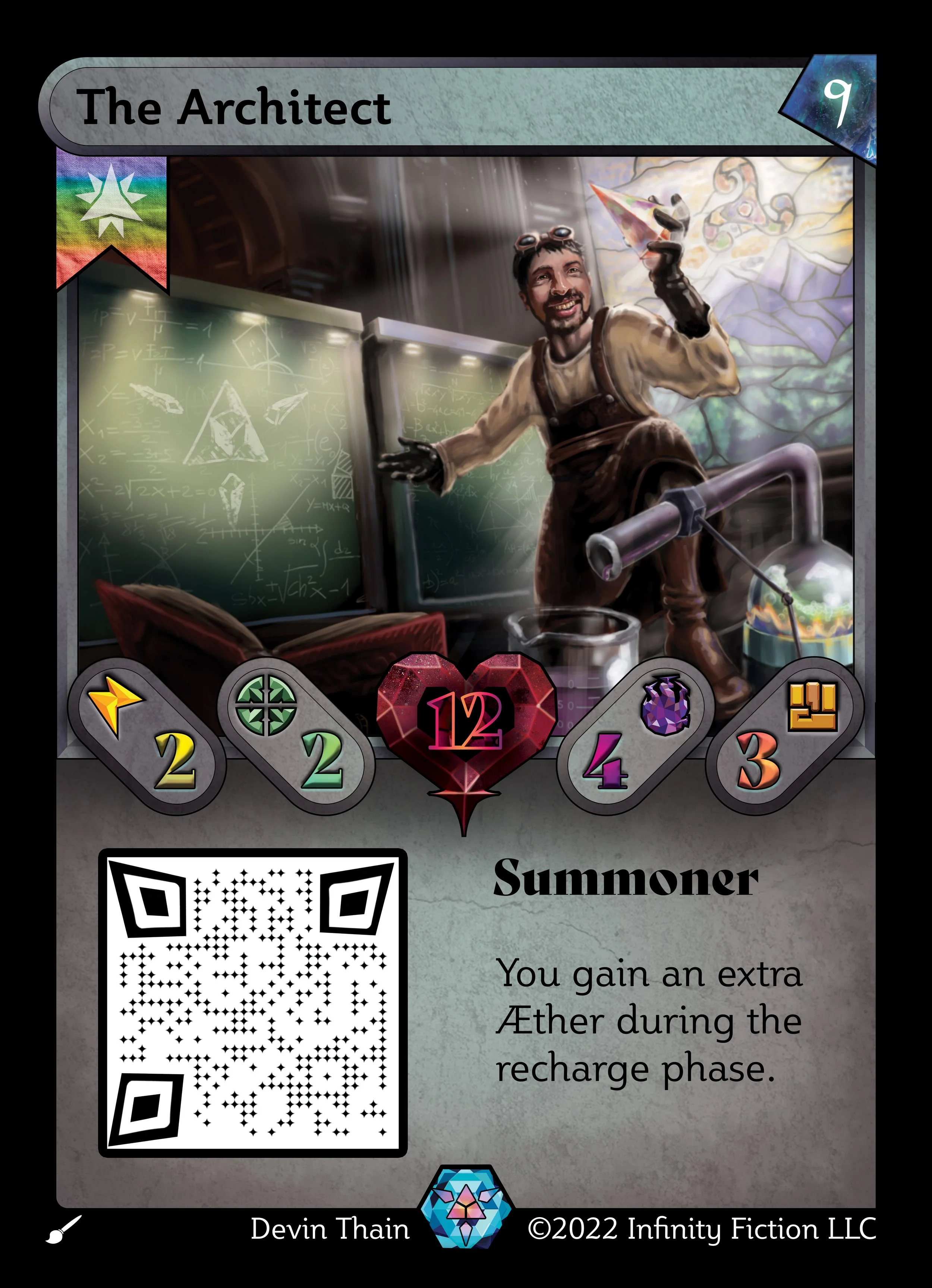
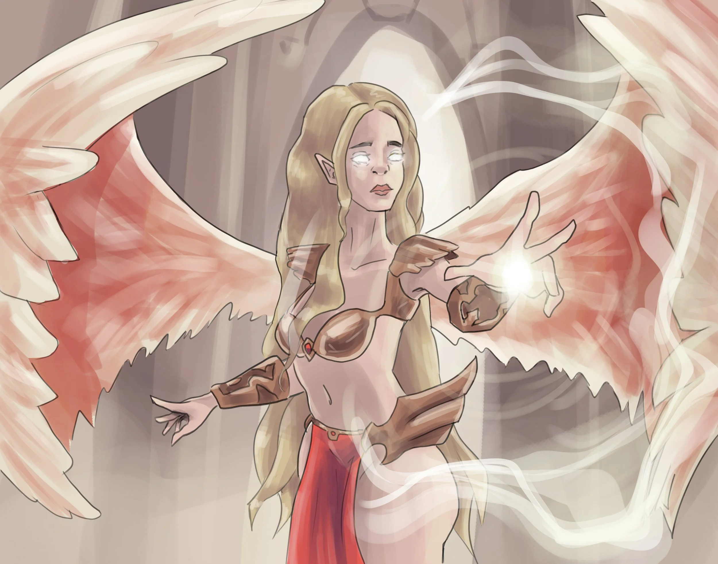
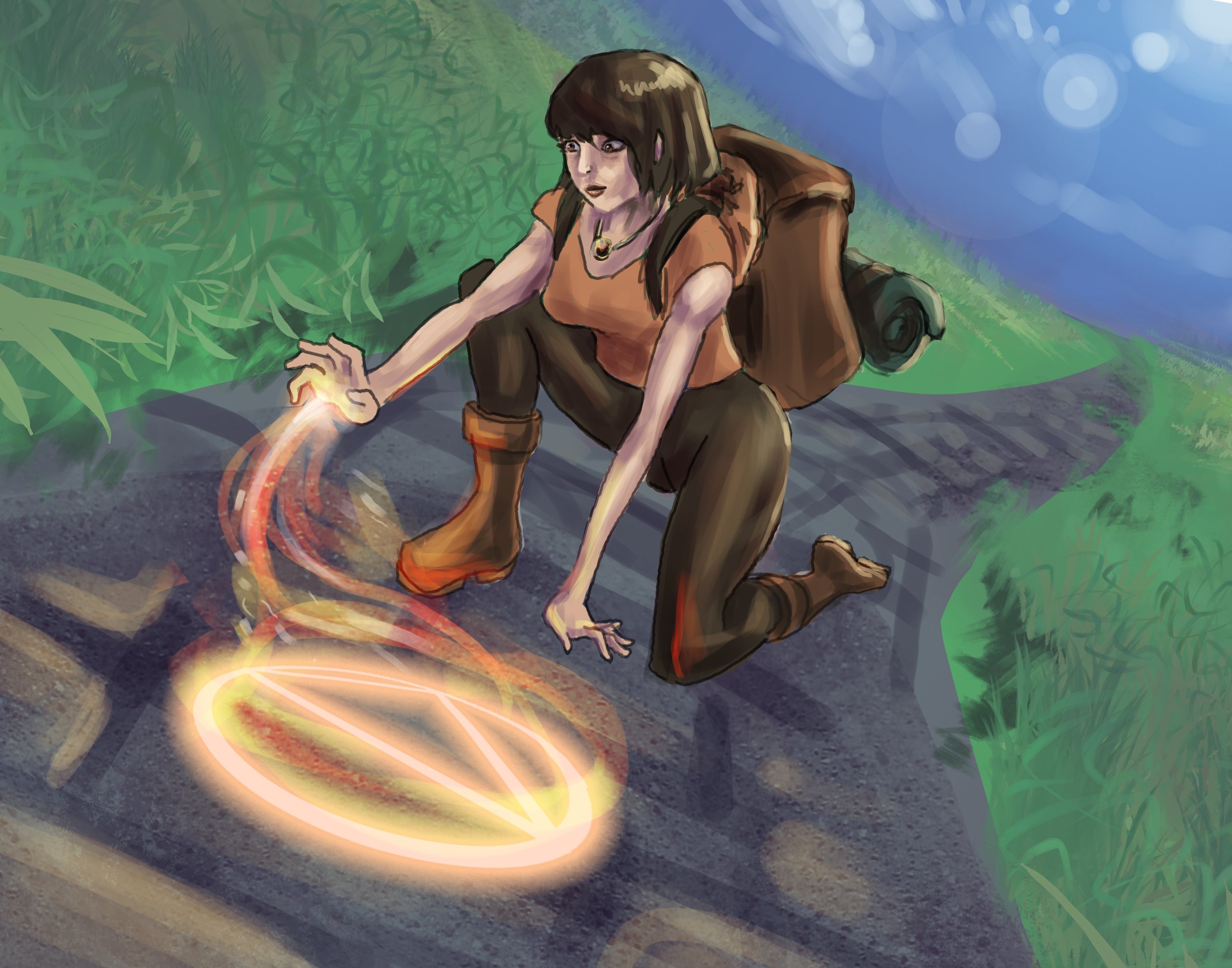
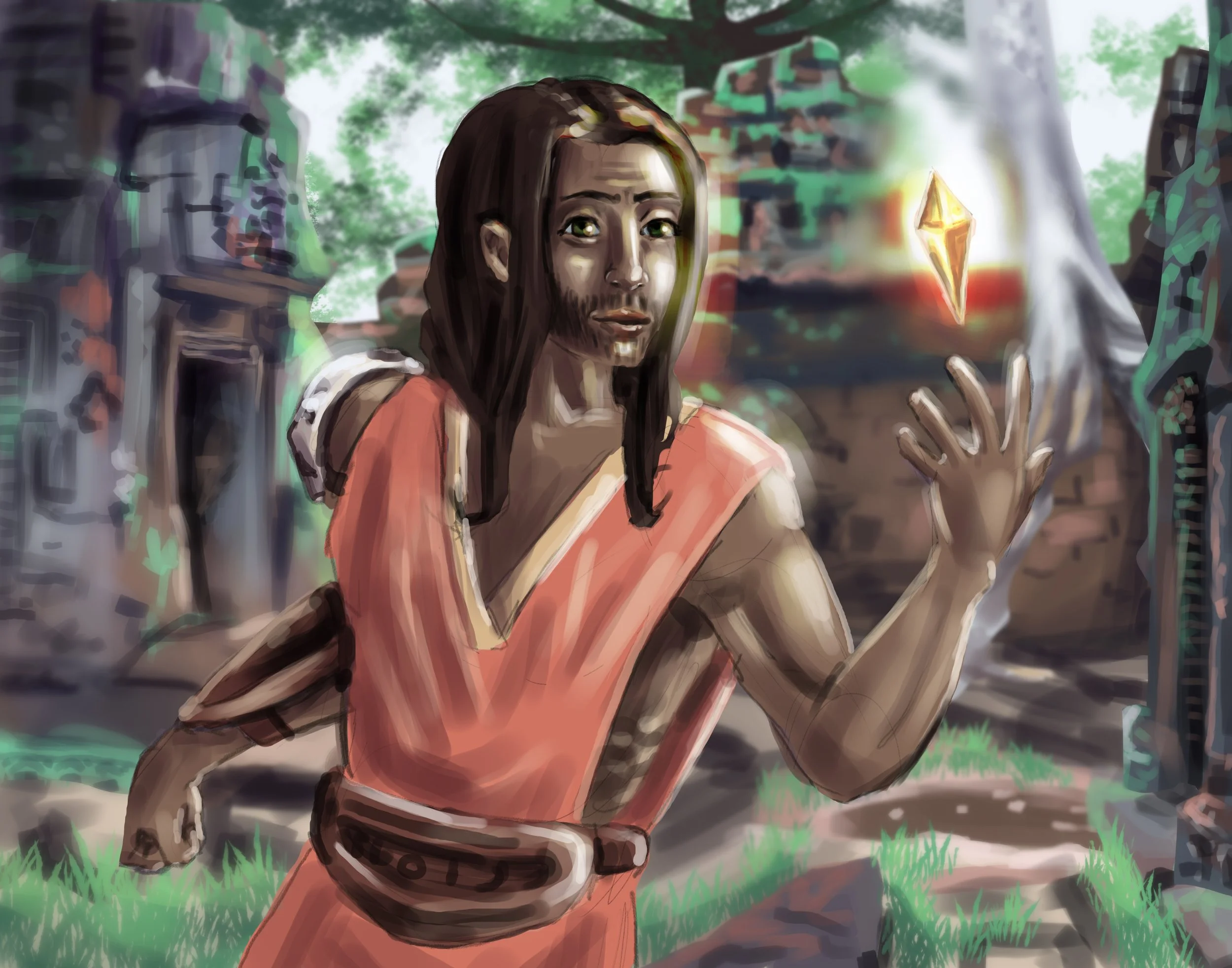
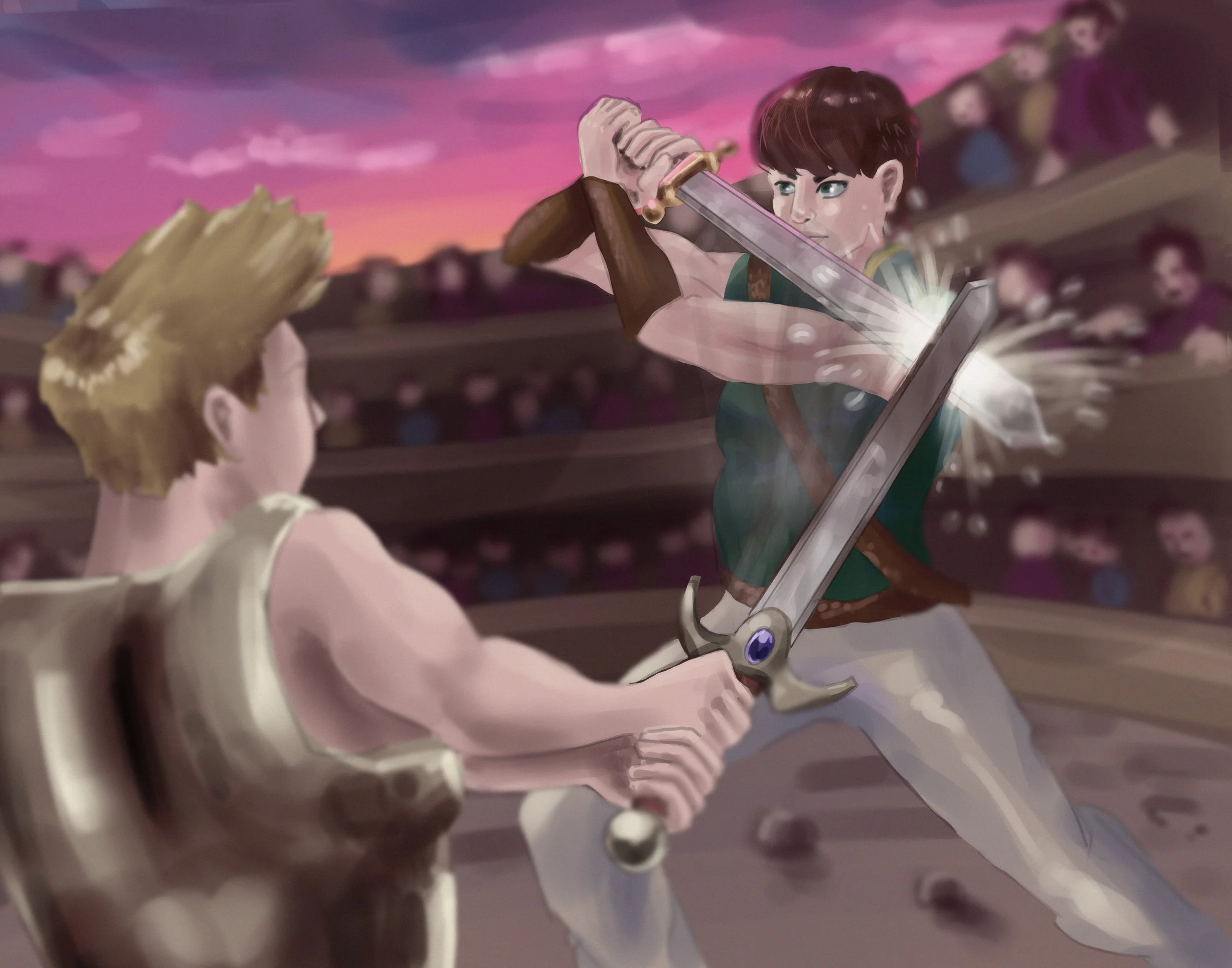
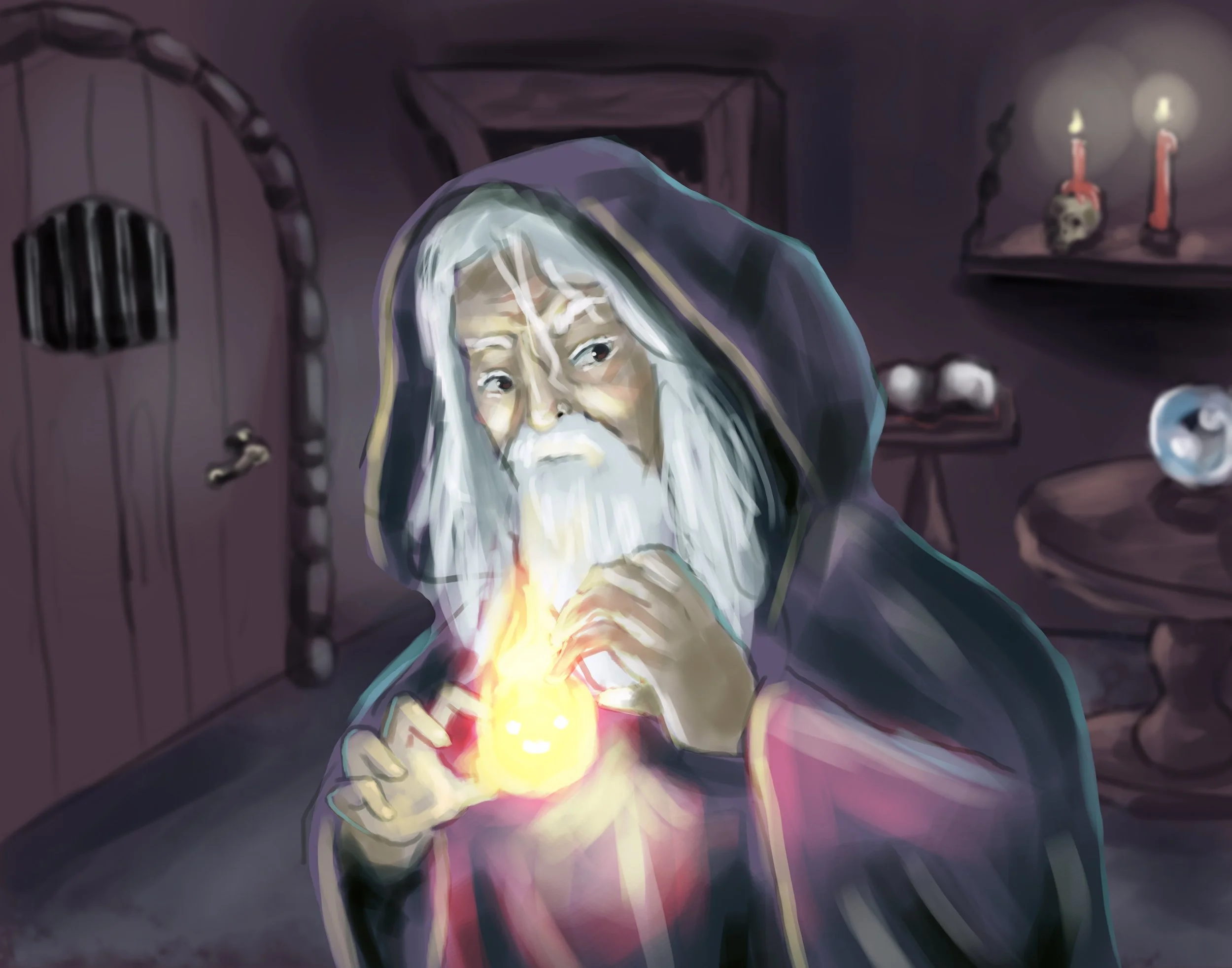
As for the card art, this was the first illustration I worked on for this project. I spent a LOT of time on this piece as it was to be used to promote the game and also includes the lovely face of the creator of this game himself! (pictured below)


After designing the card fronts, next was to design the back of the cards. I approached this knowing the logo needed to be front and center. I also warped a hexagonal grid and created nebula-like structures to replicate that warped grid as the game is played on a hexagonal board. Painted some stars and swirly effects and added the watermark in the bottom right corner.
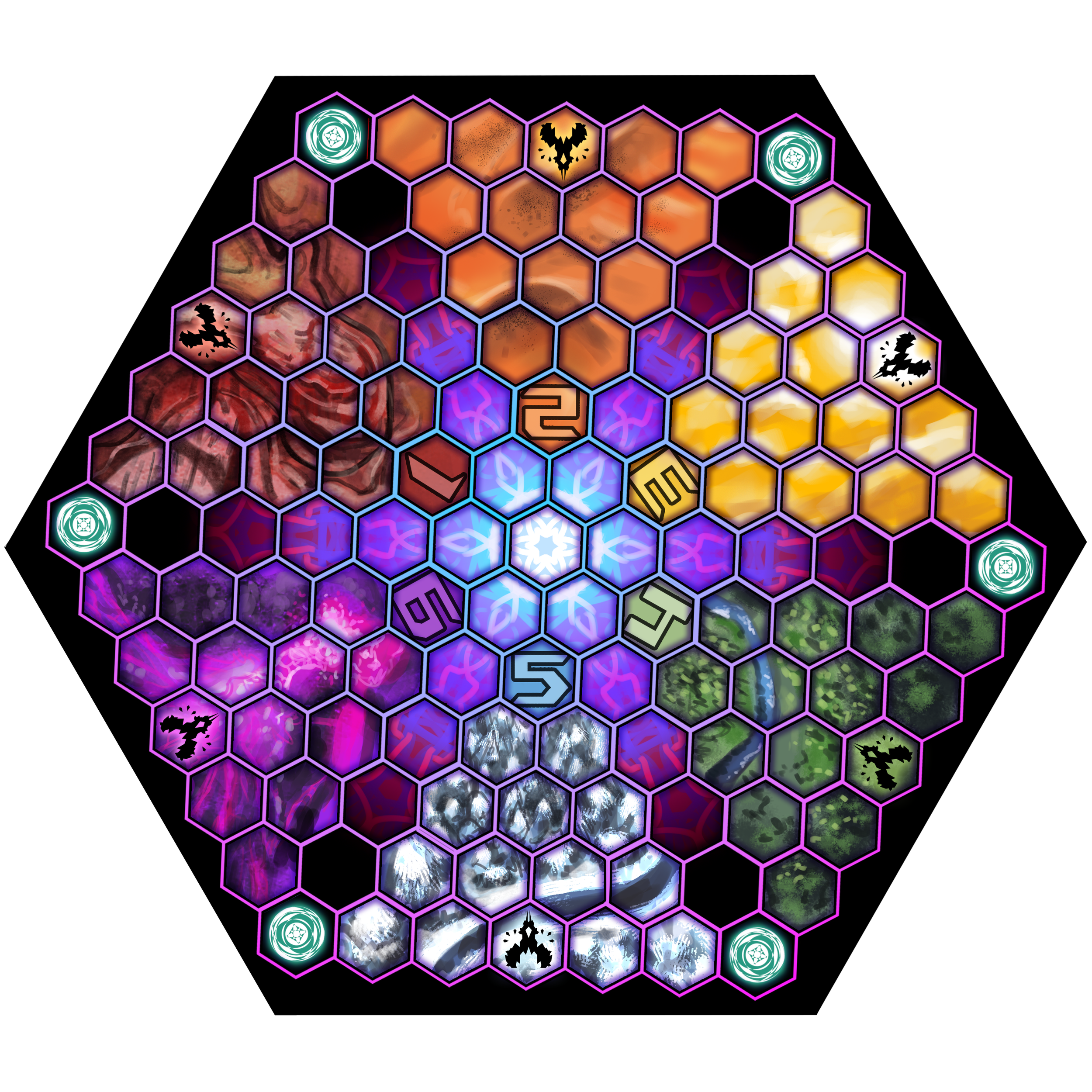
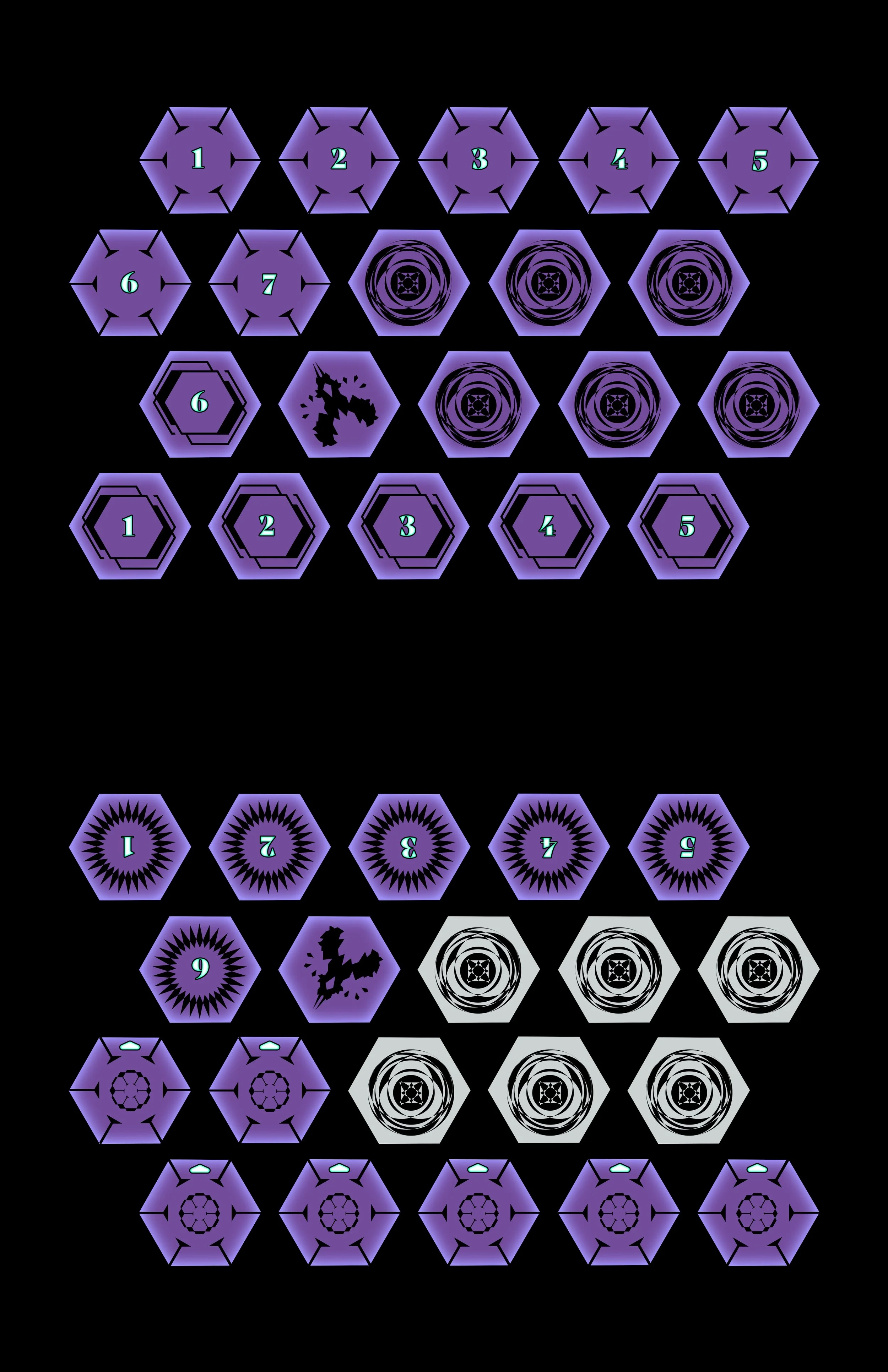
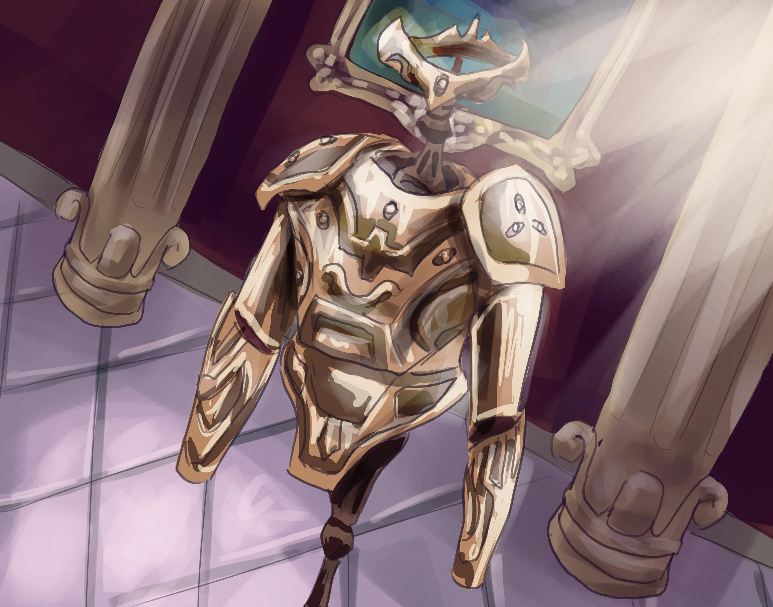
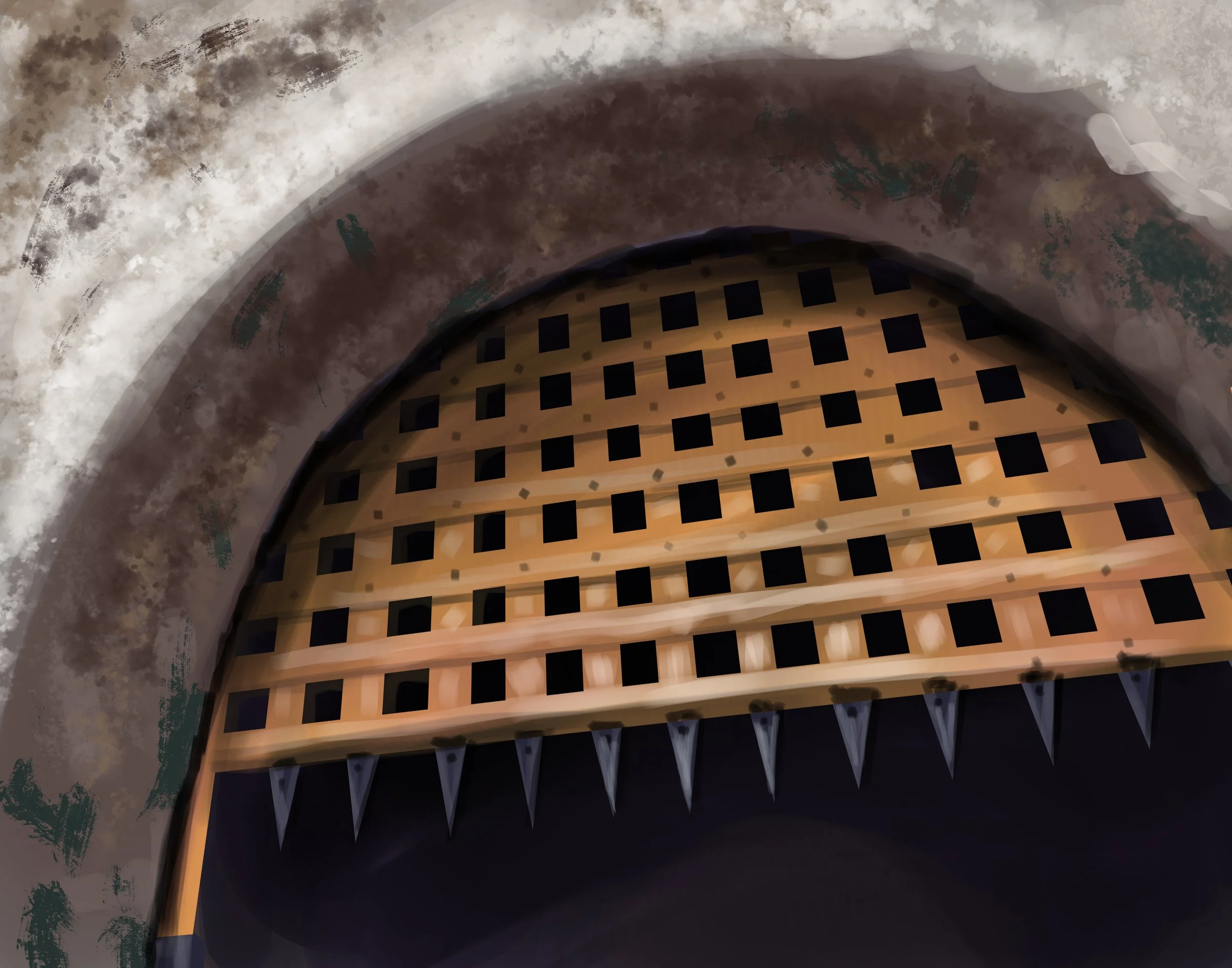
Designing the cards wasn’t all that I was tasked to do! I was tasked with the design of every single element of the game as well. Pictured here are the game board and tile pieces (but only one faction is shown. Two tile sheets were made for each faction.)
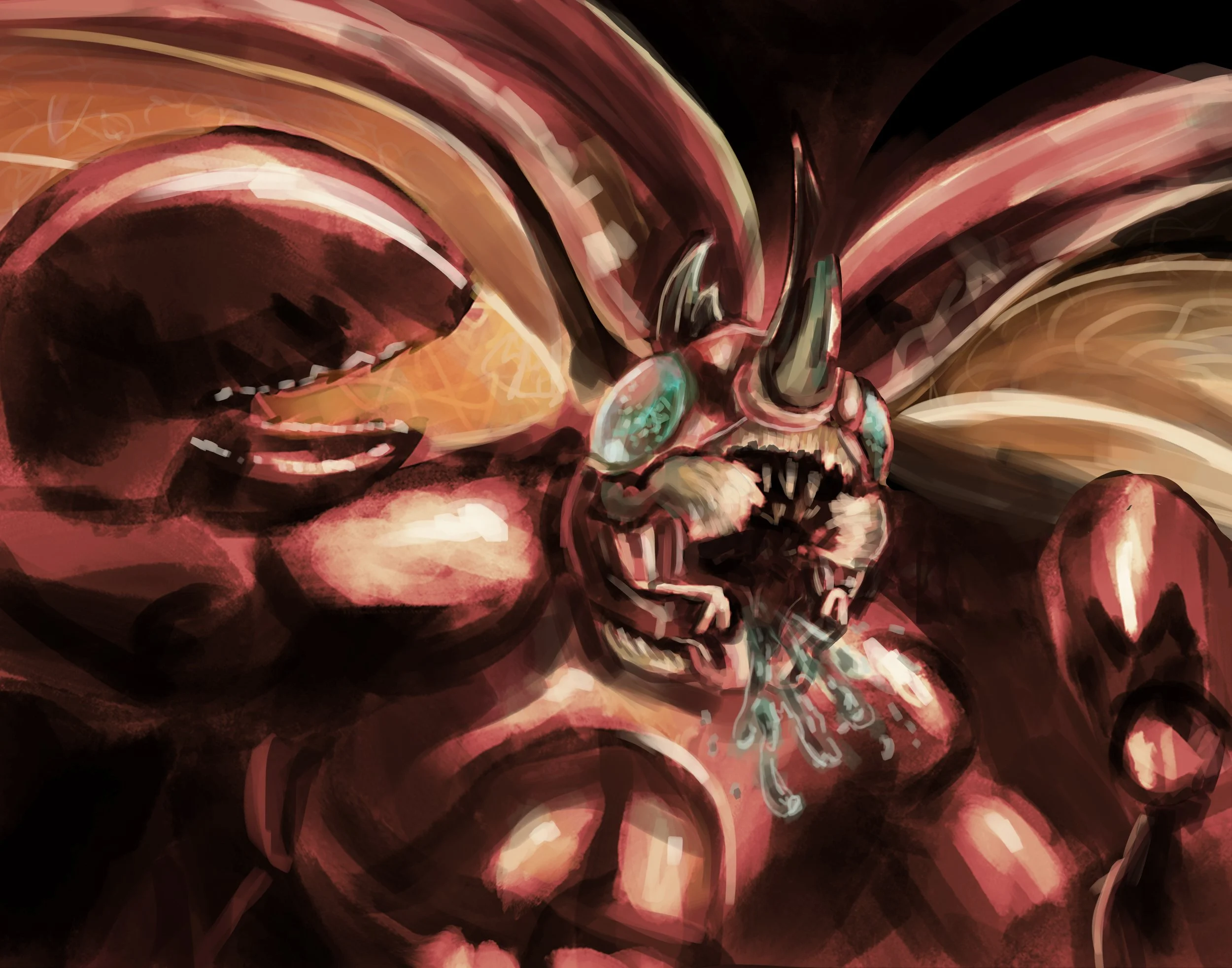
Beasts
Humans
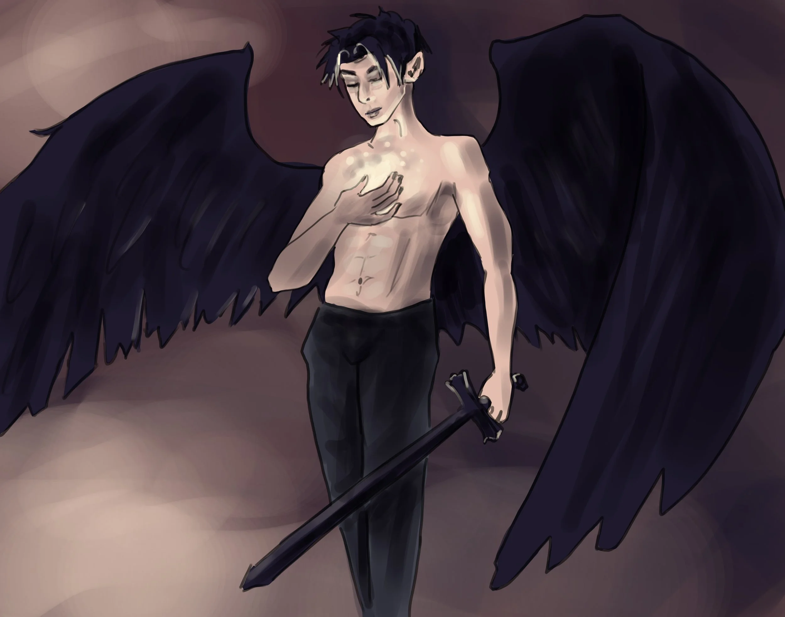
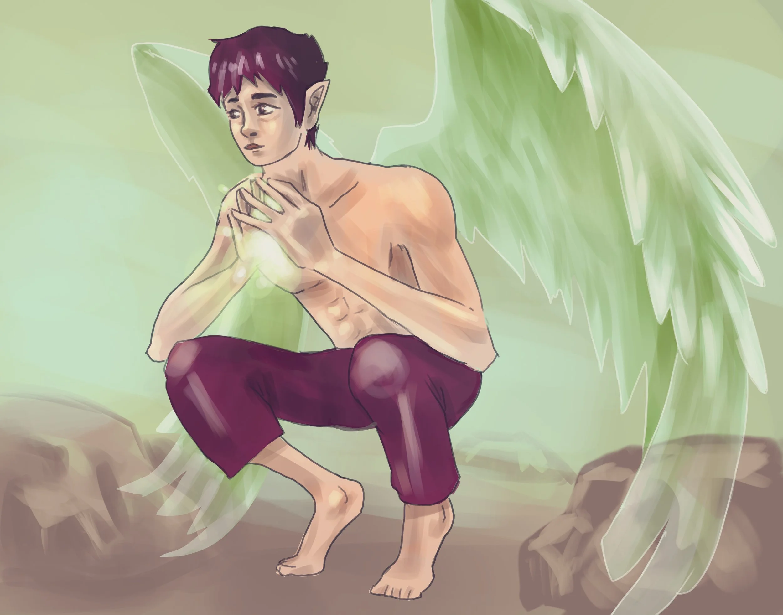
Angels
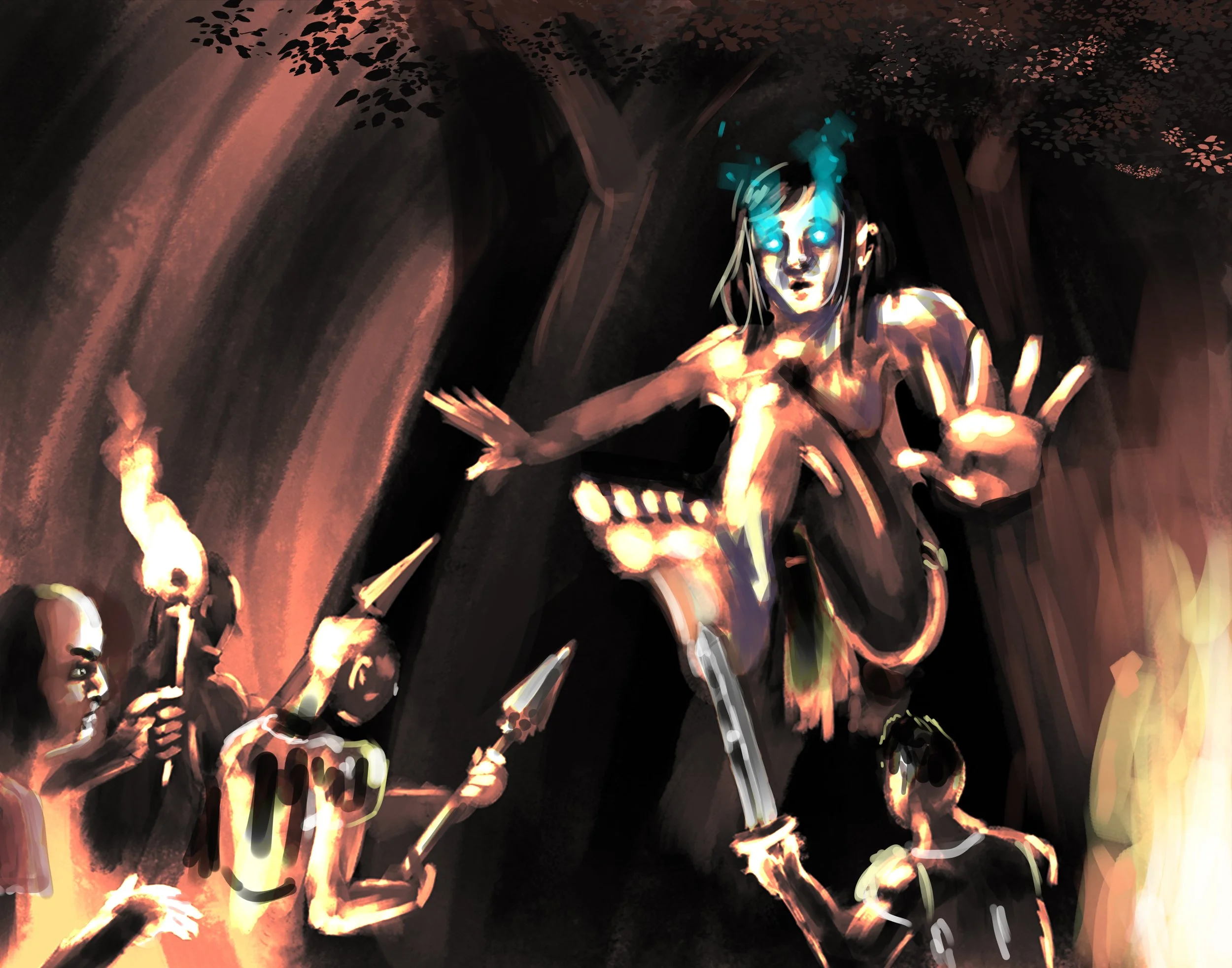
Elves
Undead
Demons
Factionless


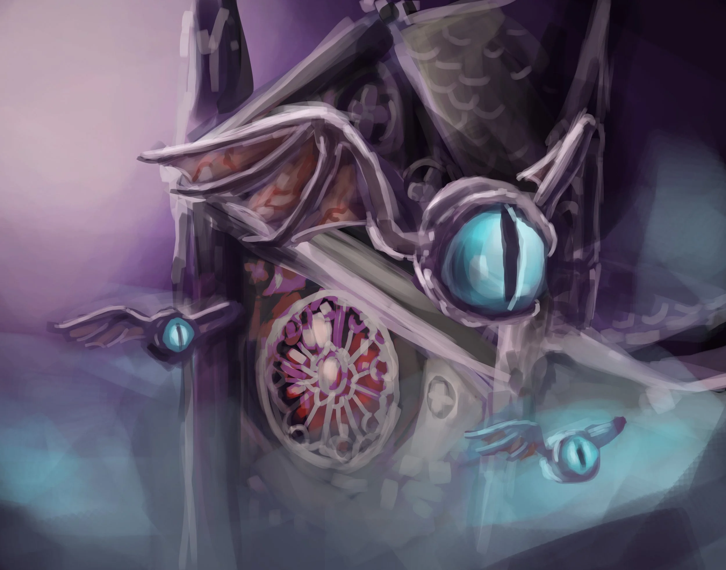
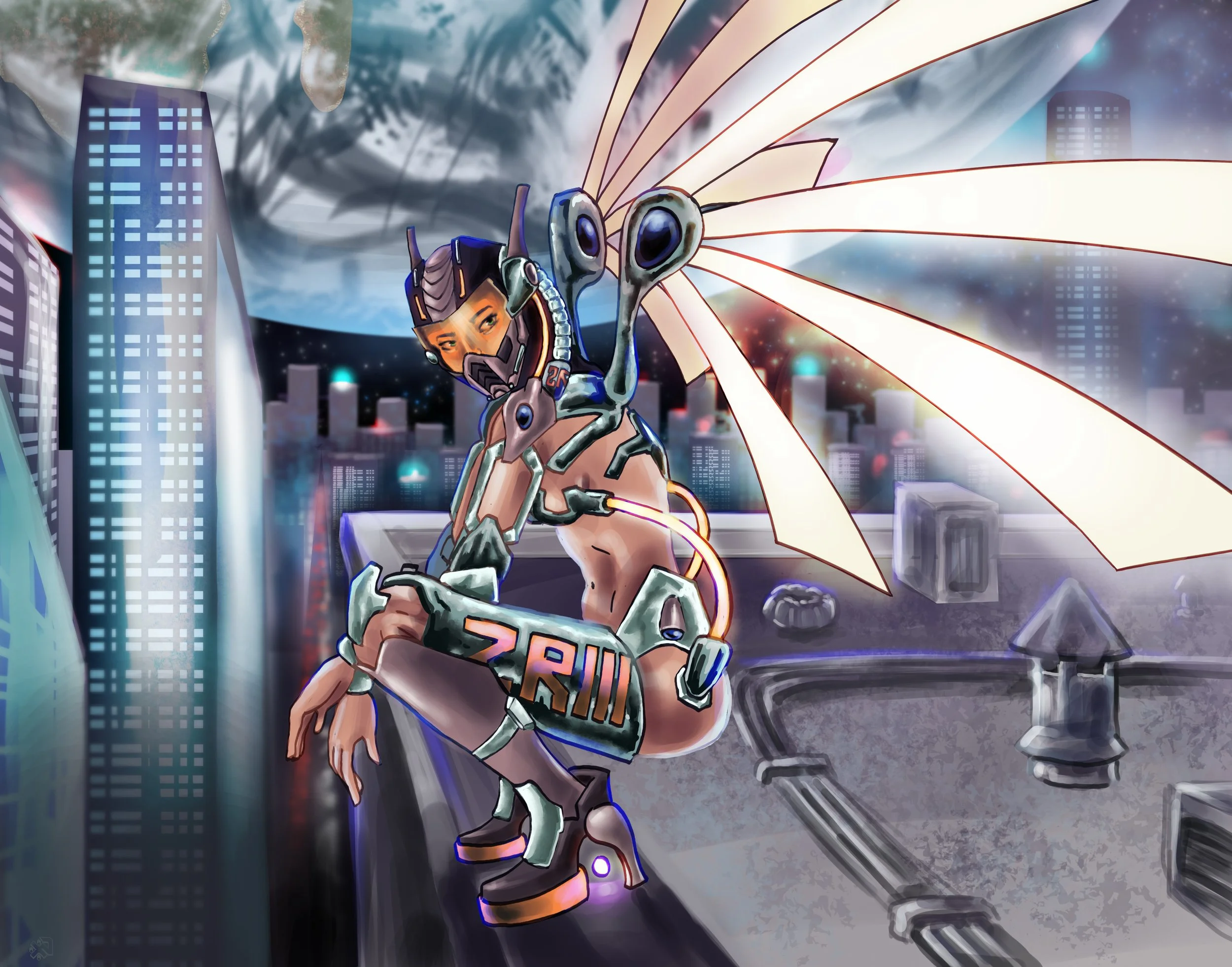
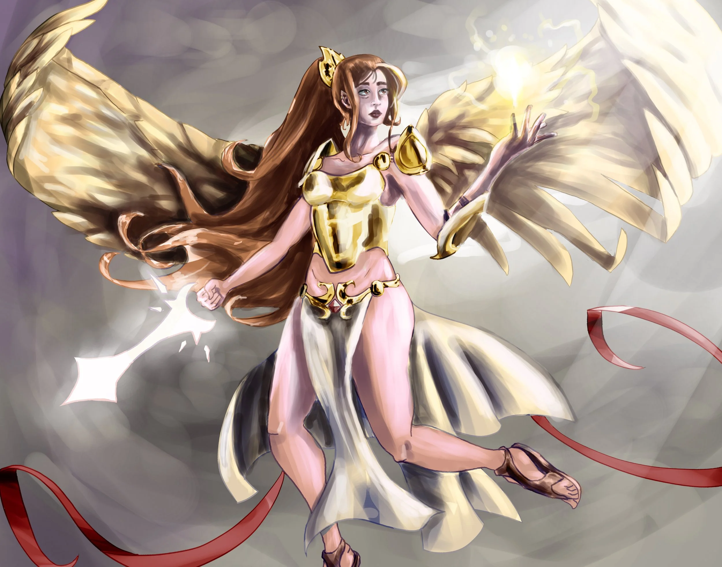
Another design element I was tasked with was designing logos for each faction type. I thoroughly enjoyed this endeavor and I feel like I came up with some really cohesive designs. For example, the angels are the faction that watch over everyone so their design is an eye embedded within a wing. The elves logo functions both as an elf ear and as a leaf as they are closest to nature.
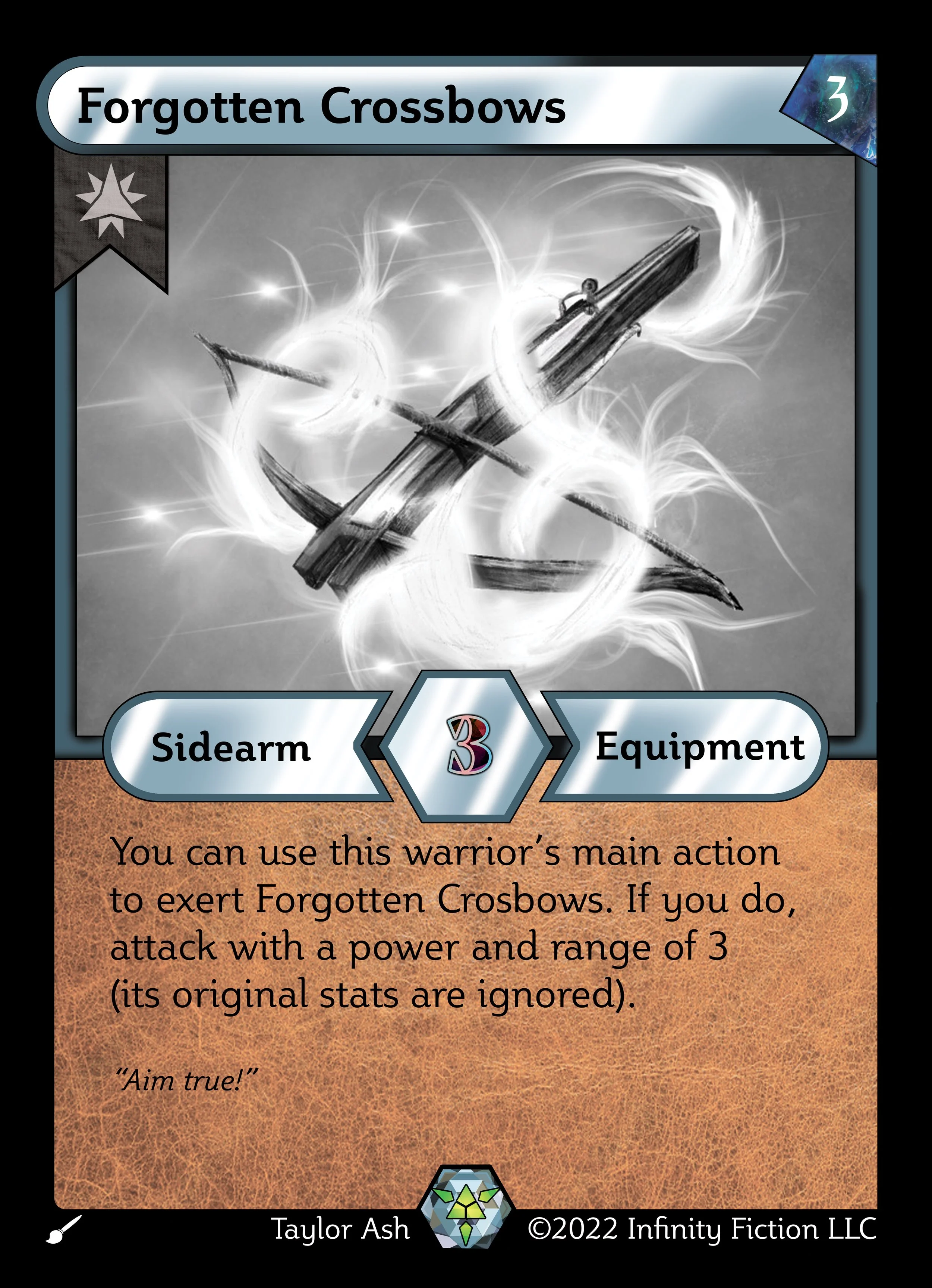
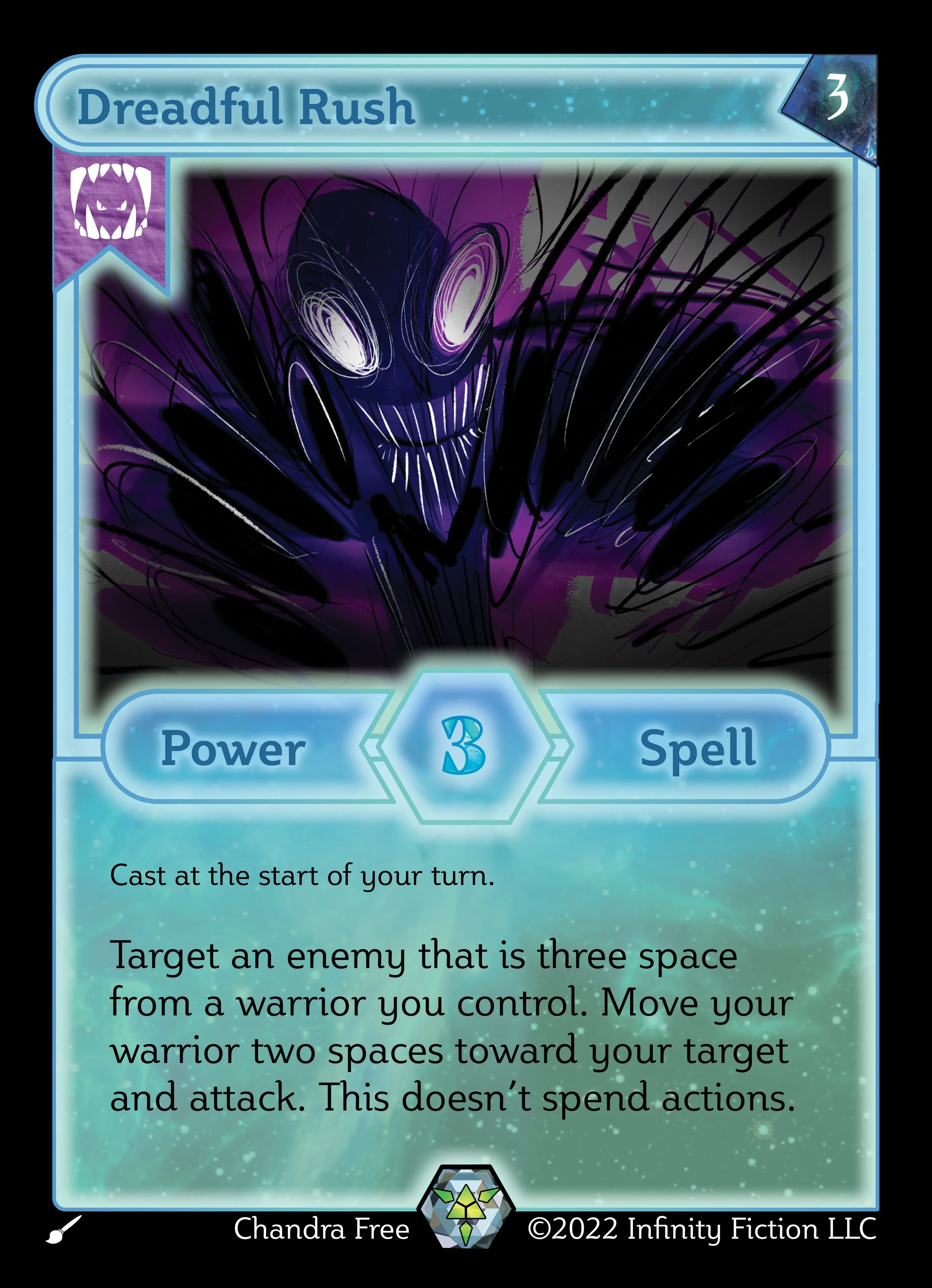
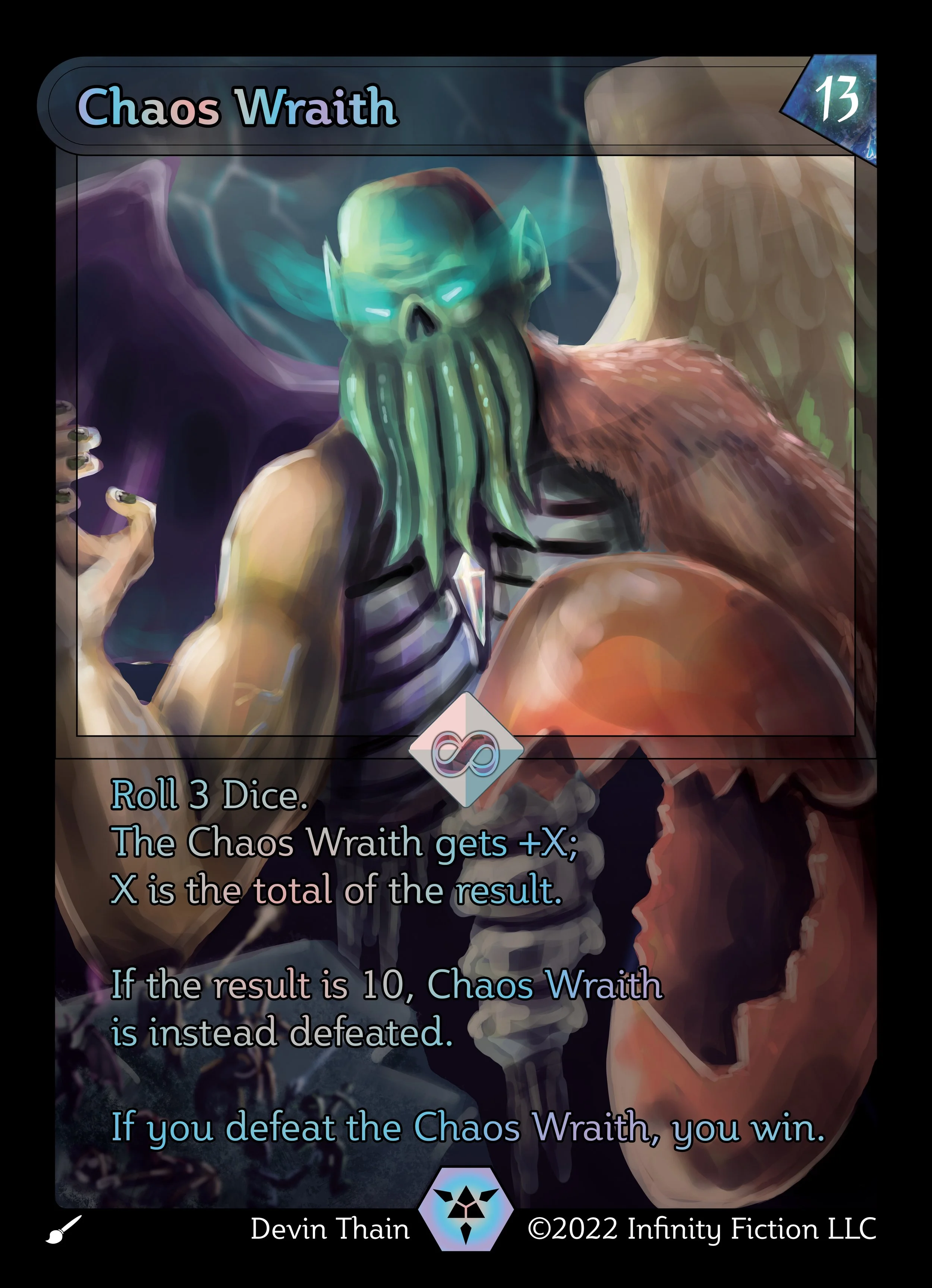

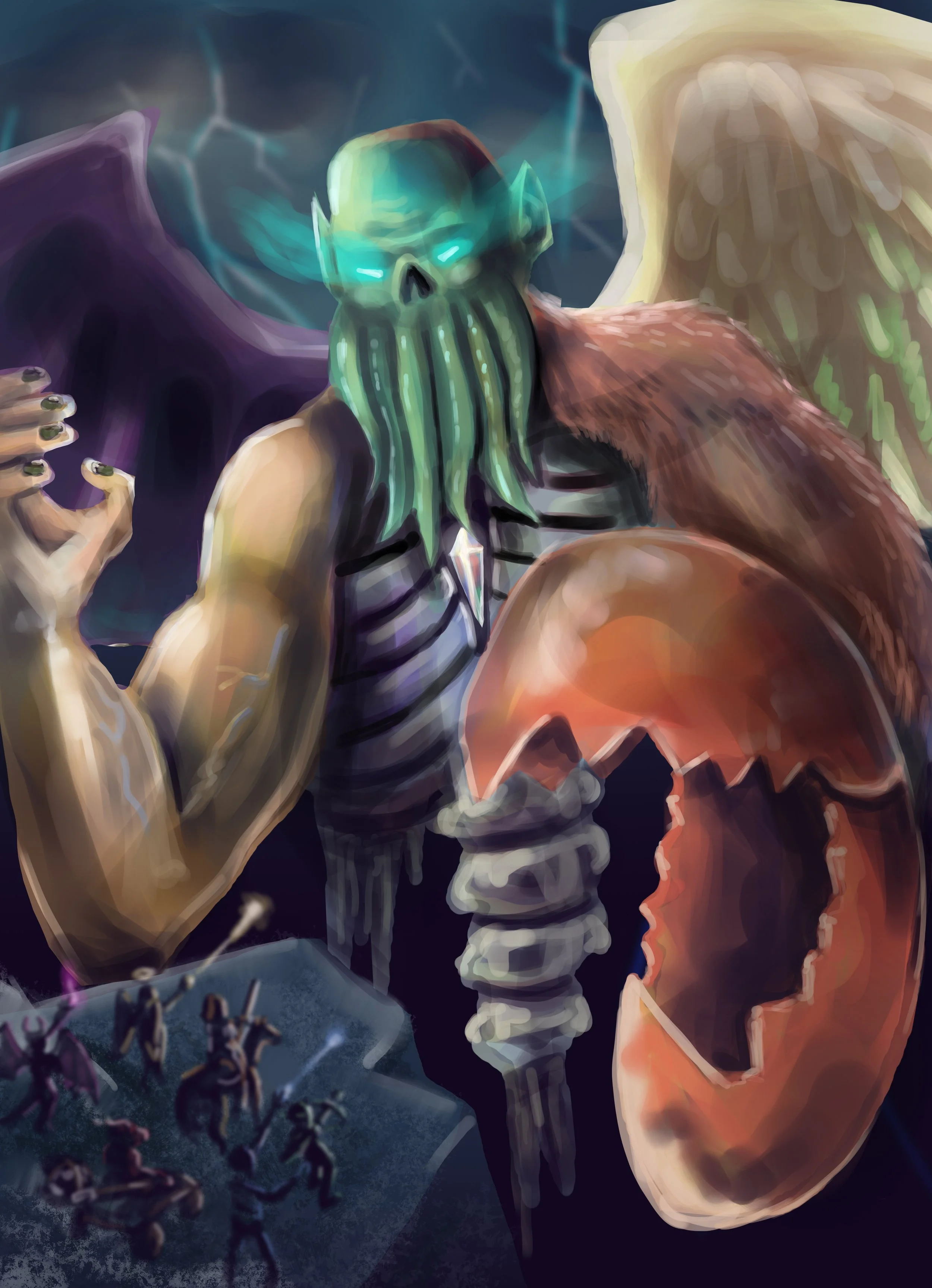
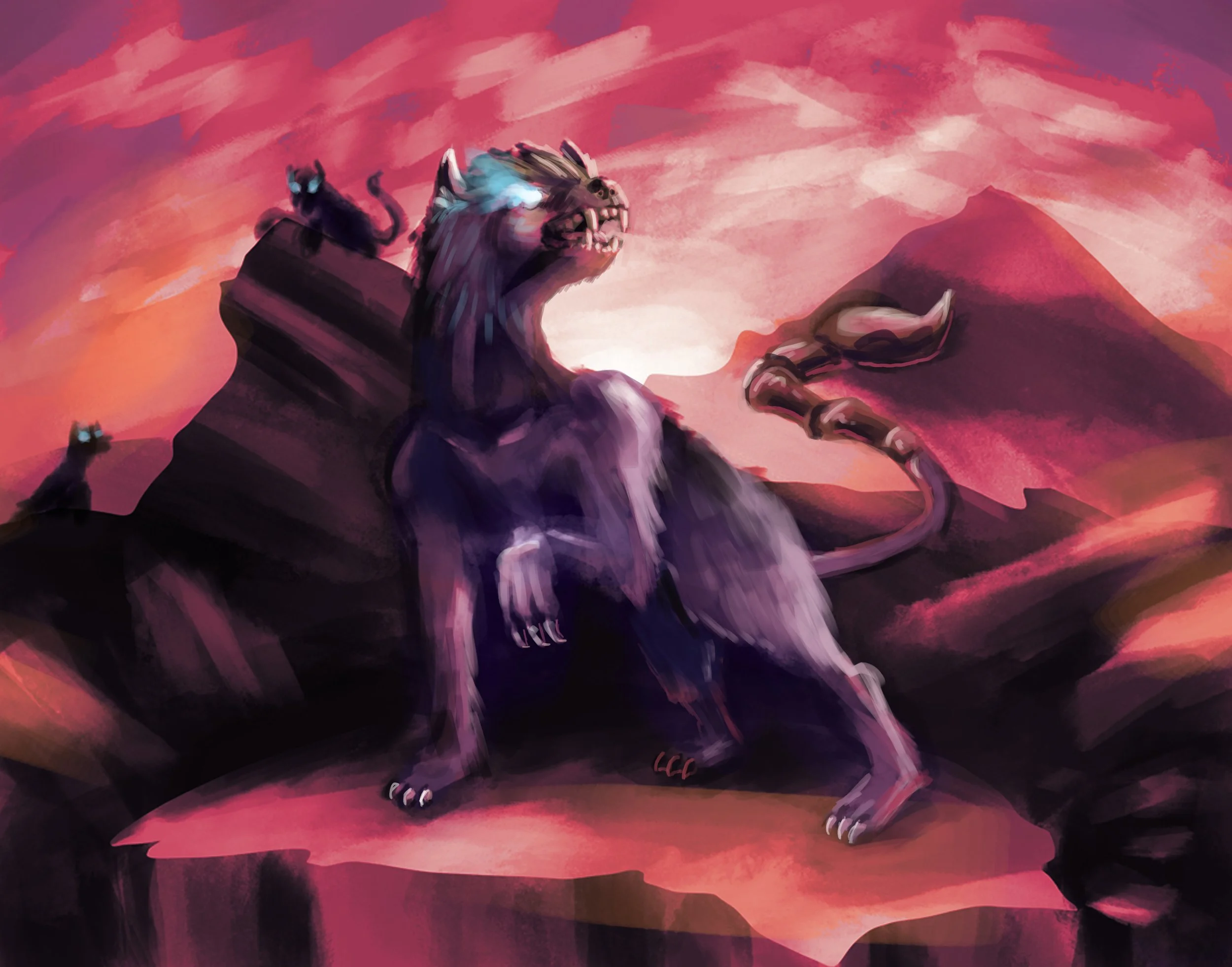
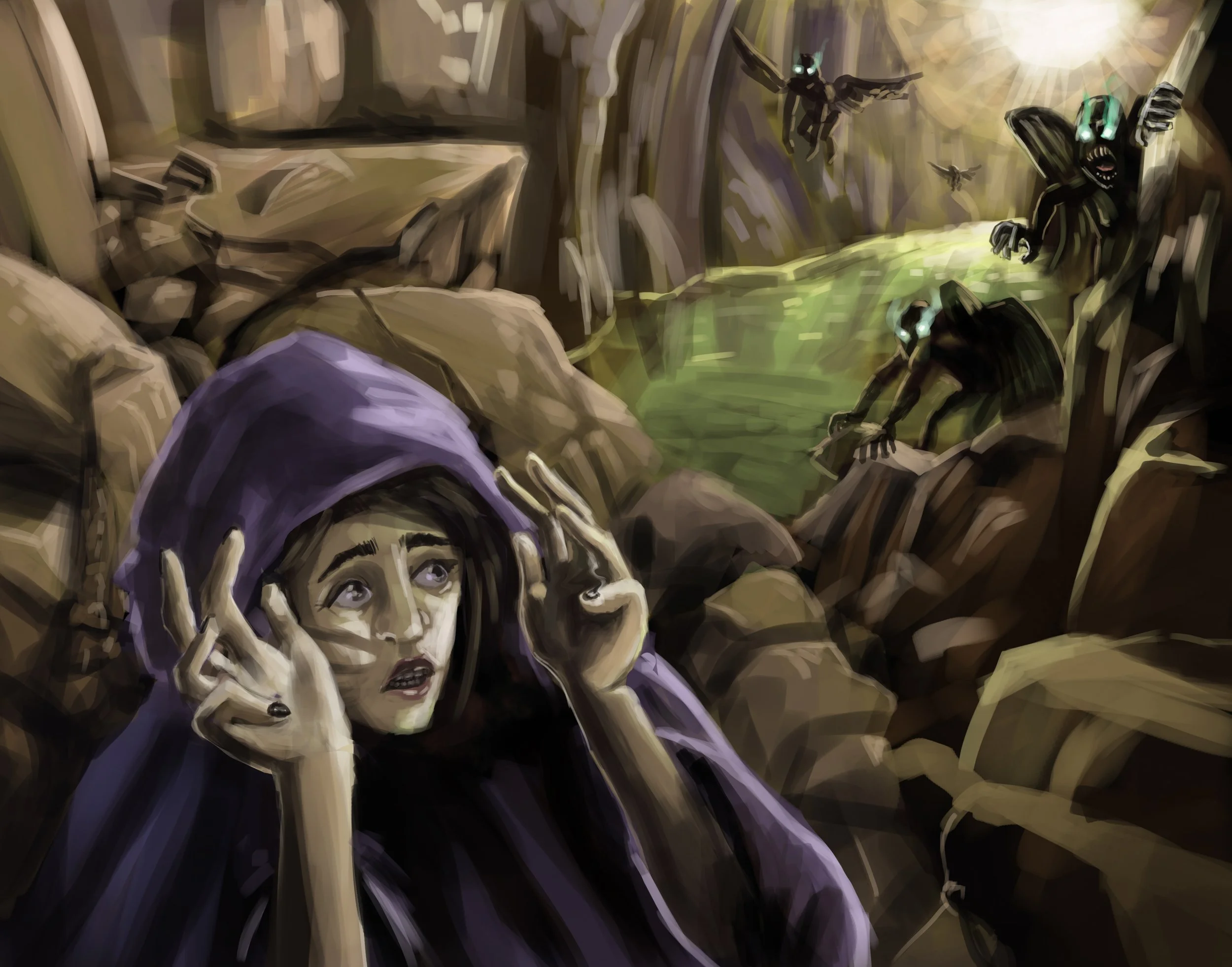
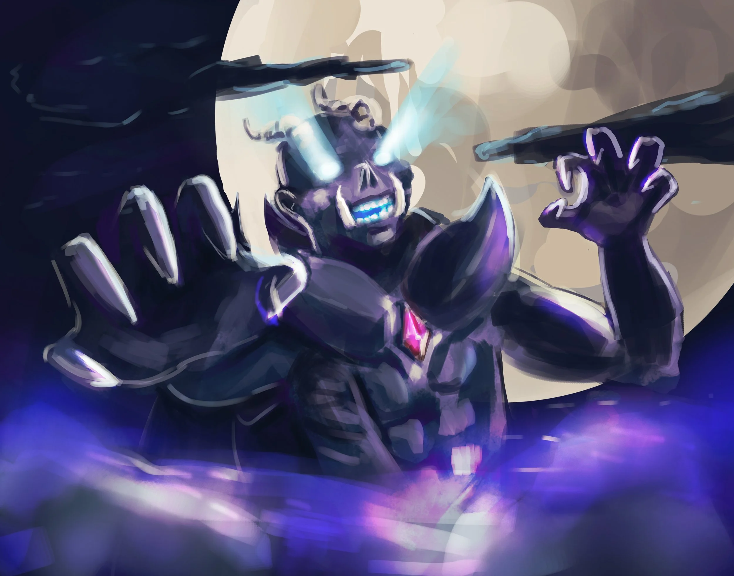
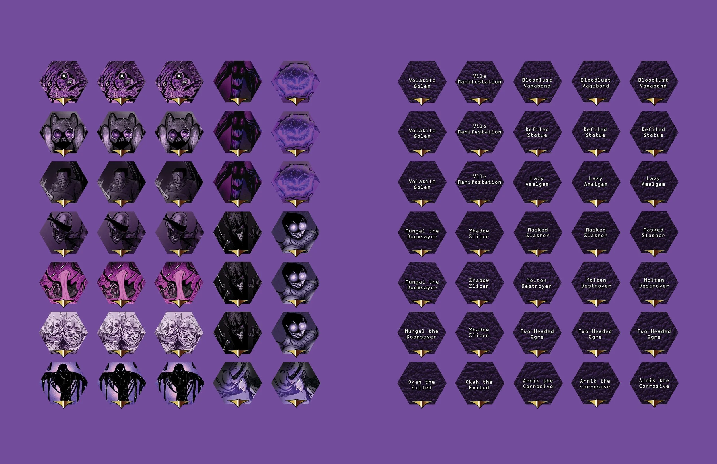
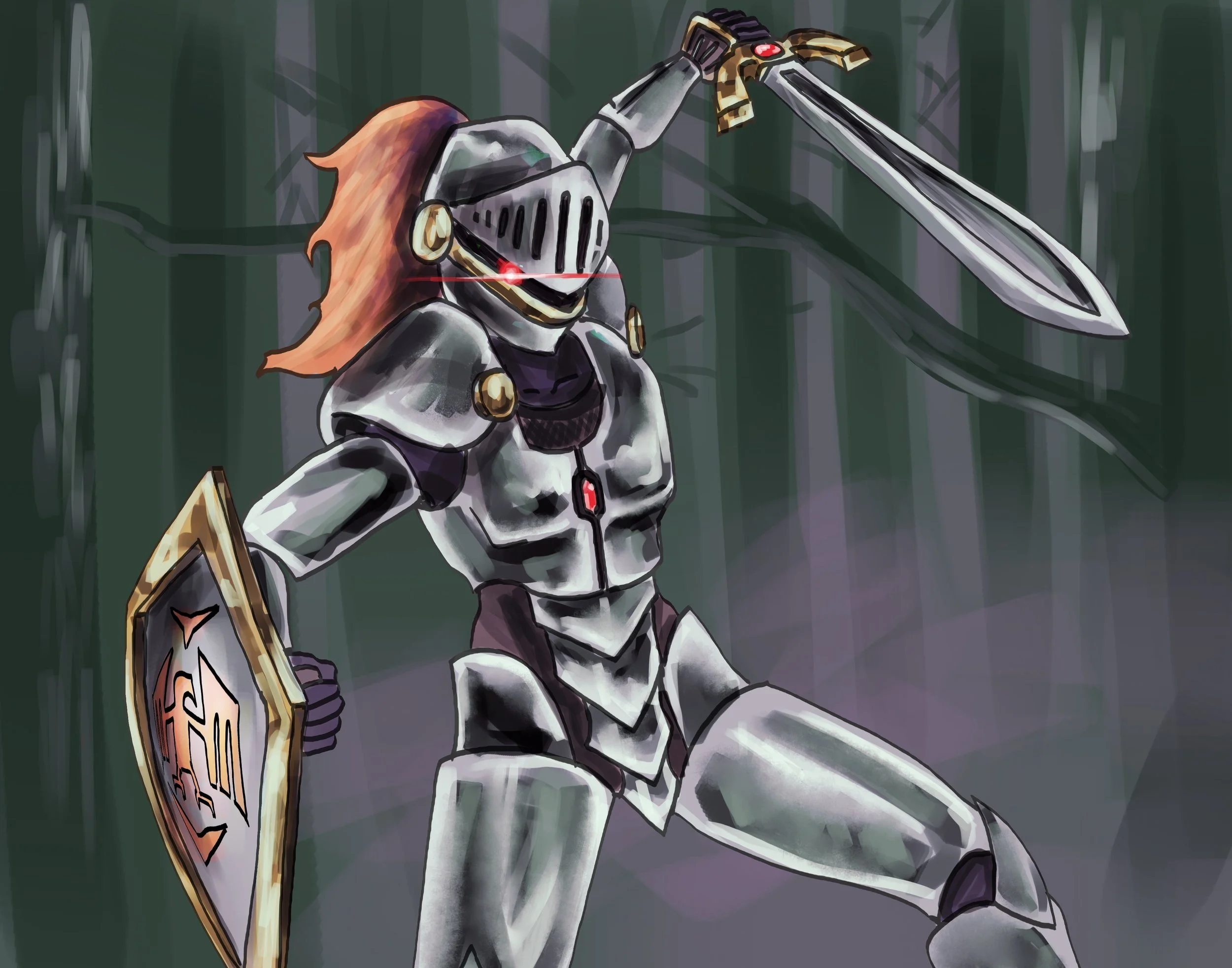
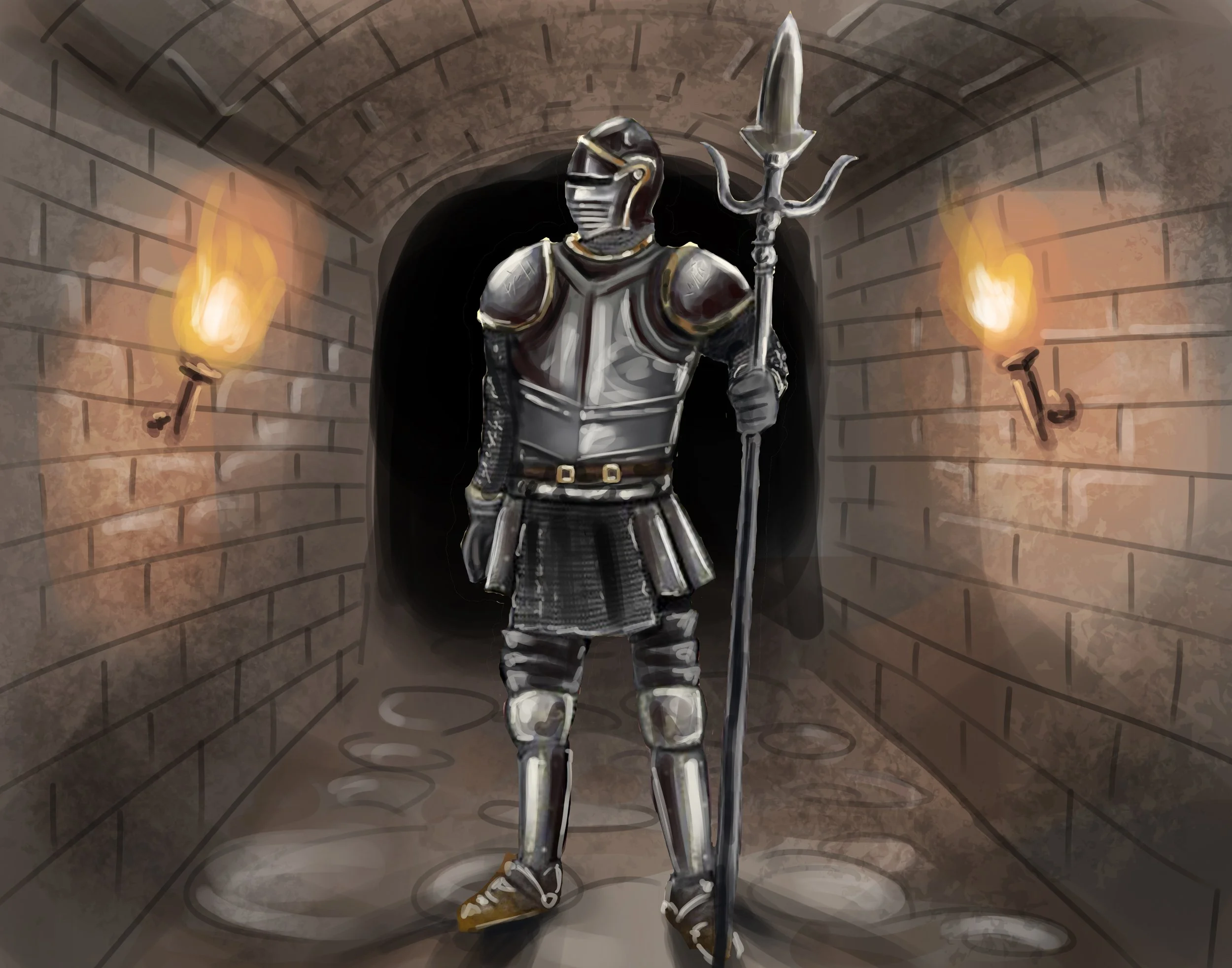
I was also tasked with adding three additional card types. One for spells, one for the wraiths, and one for equipment and I achieved this by using an astral-like design for the spells and combining leather and metal textures for the equipment. The wraiths, I went for a blue fire texture to showcase the evil nature of the wraiths. Pictured to the right of the wraith cards is the Chaos Wraith, which I made a full art card out of to showcase their power and have players notice immediately when they draw him that they are about to have to fight for their lives.
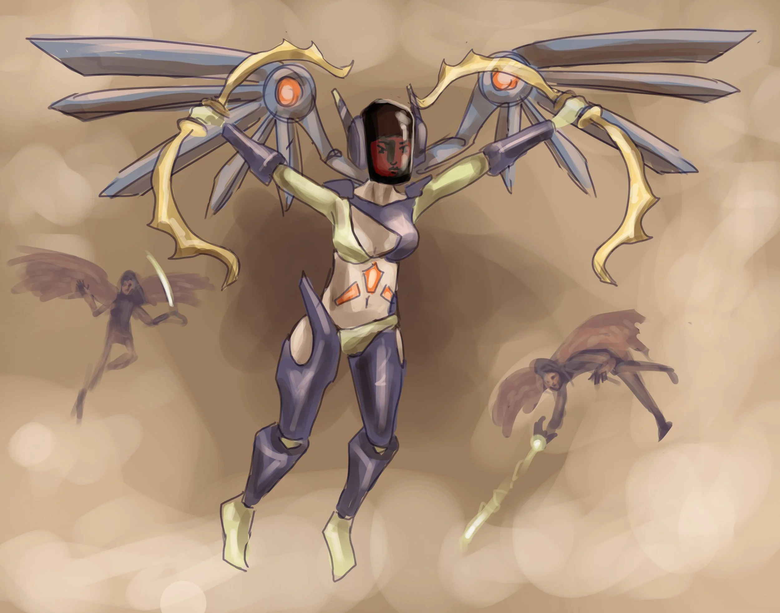
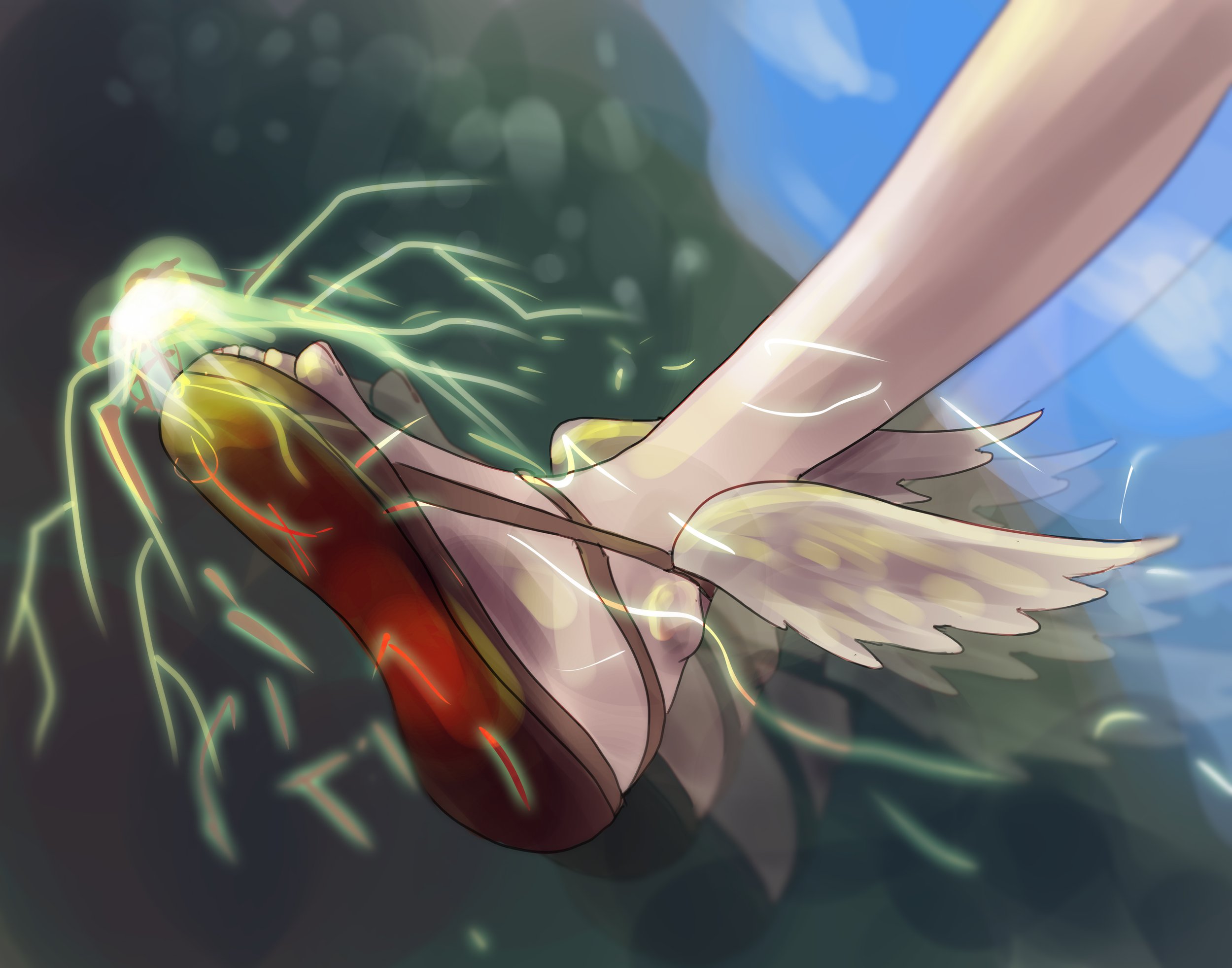
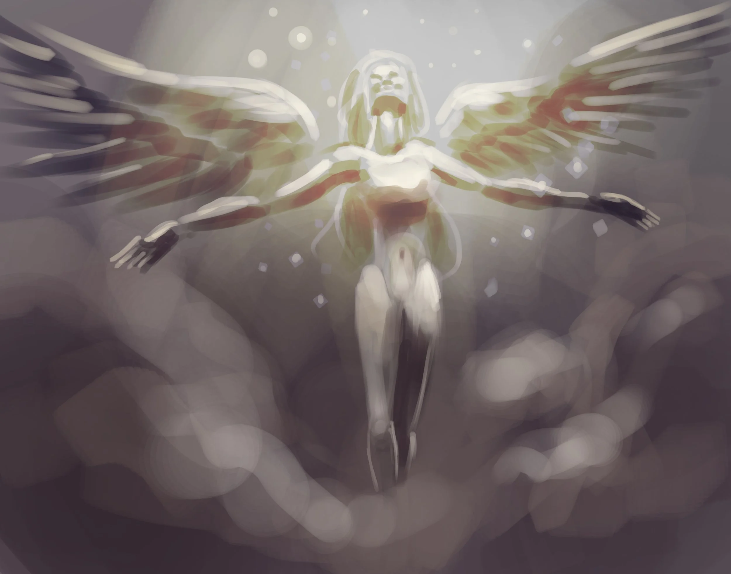
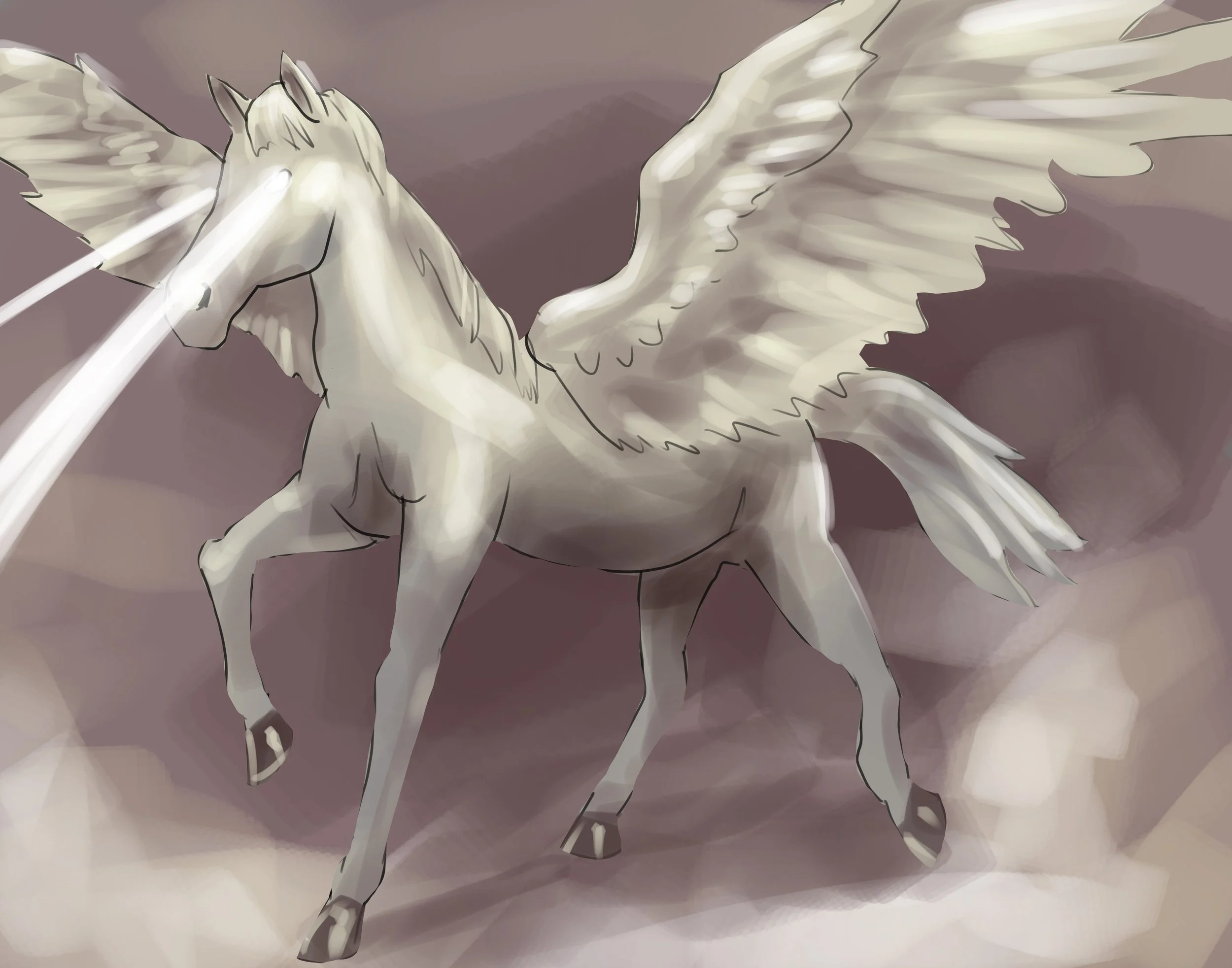
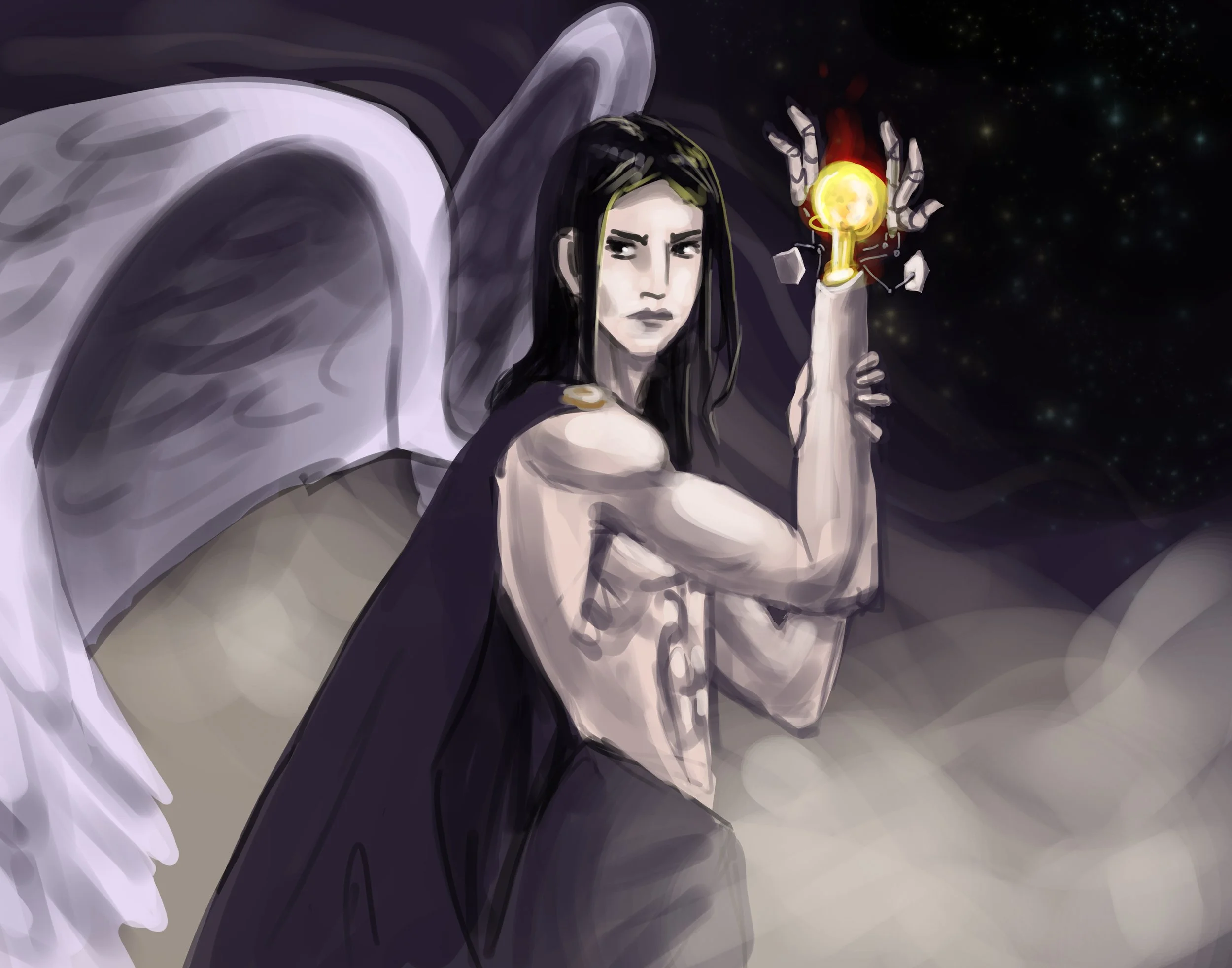
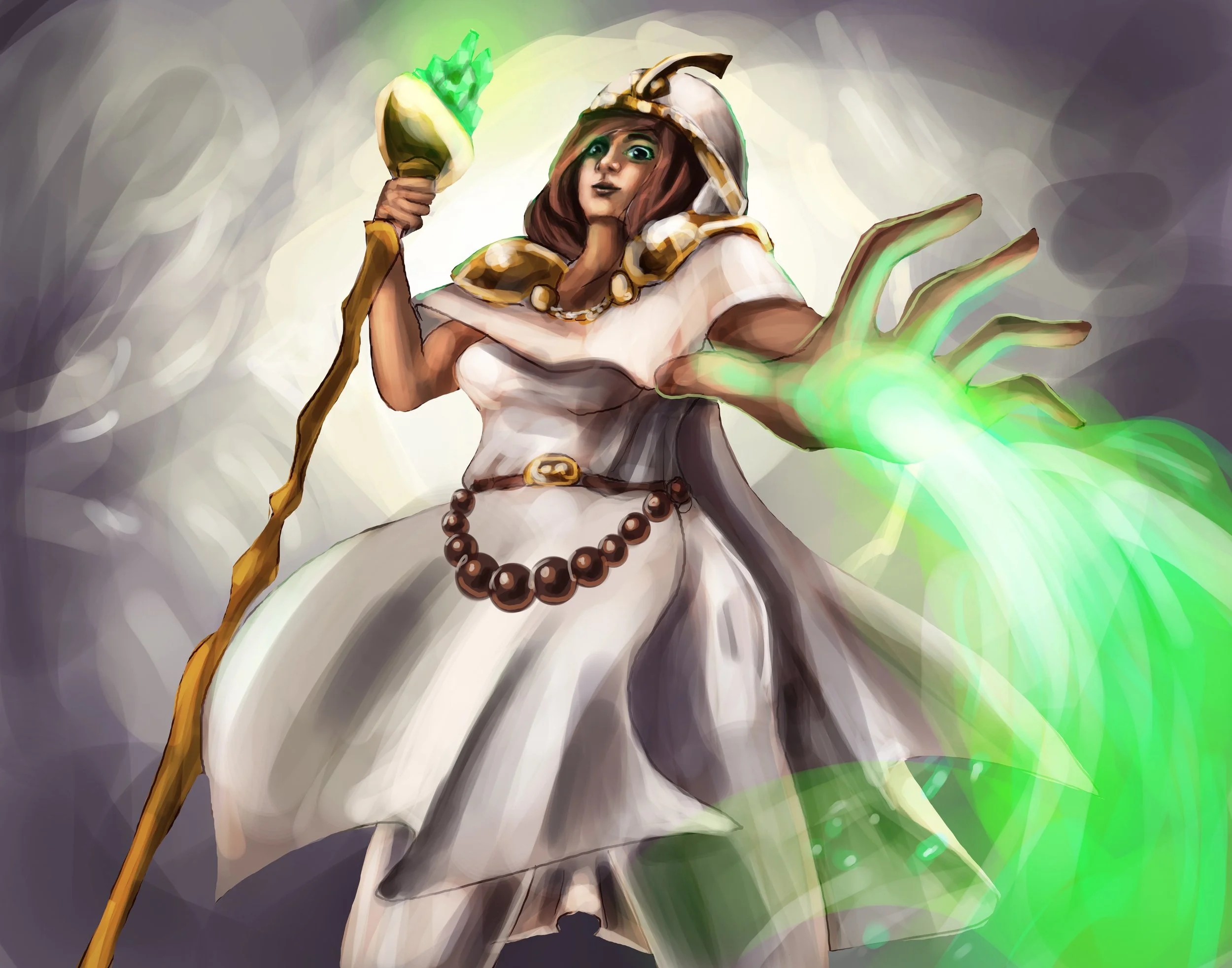
Angel Card Illustrations

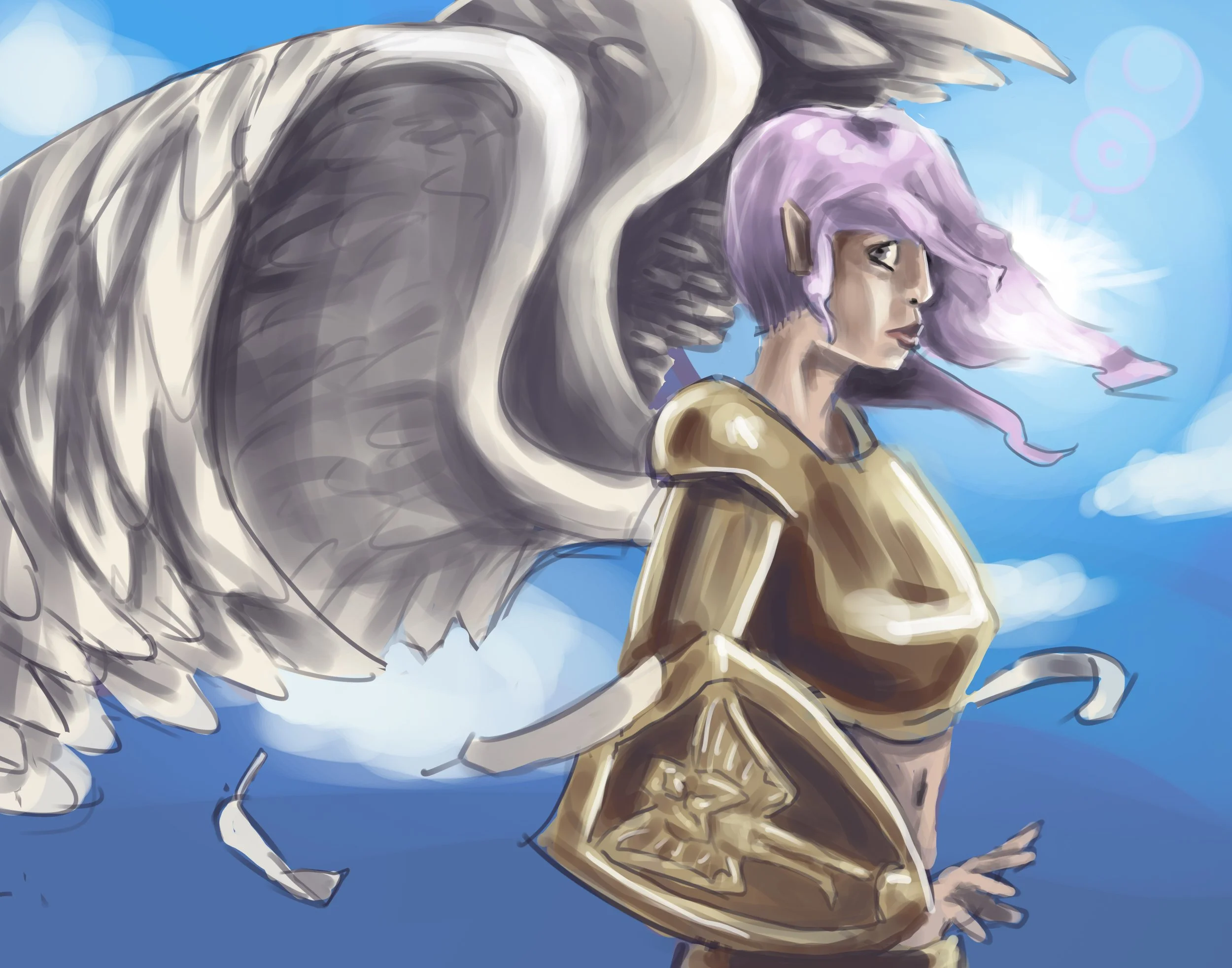
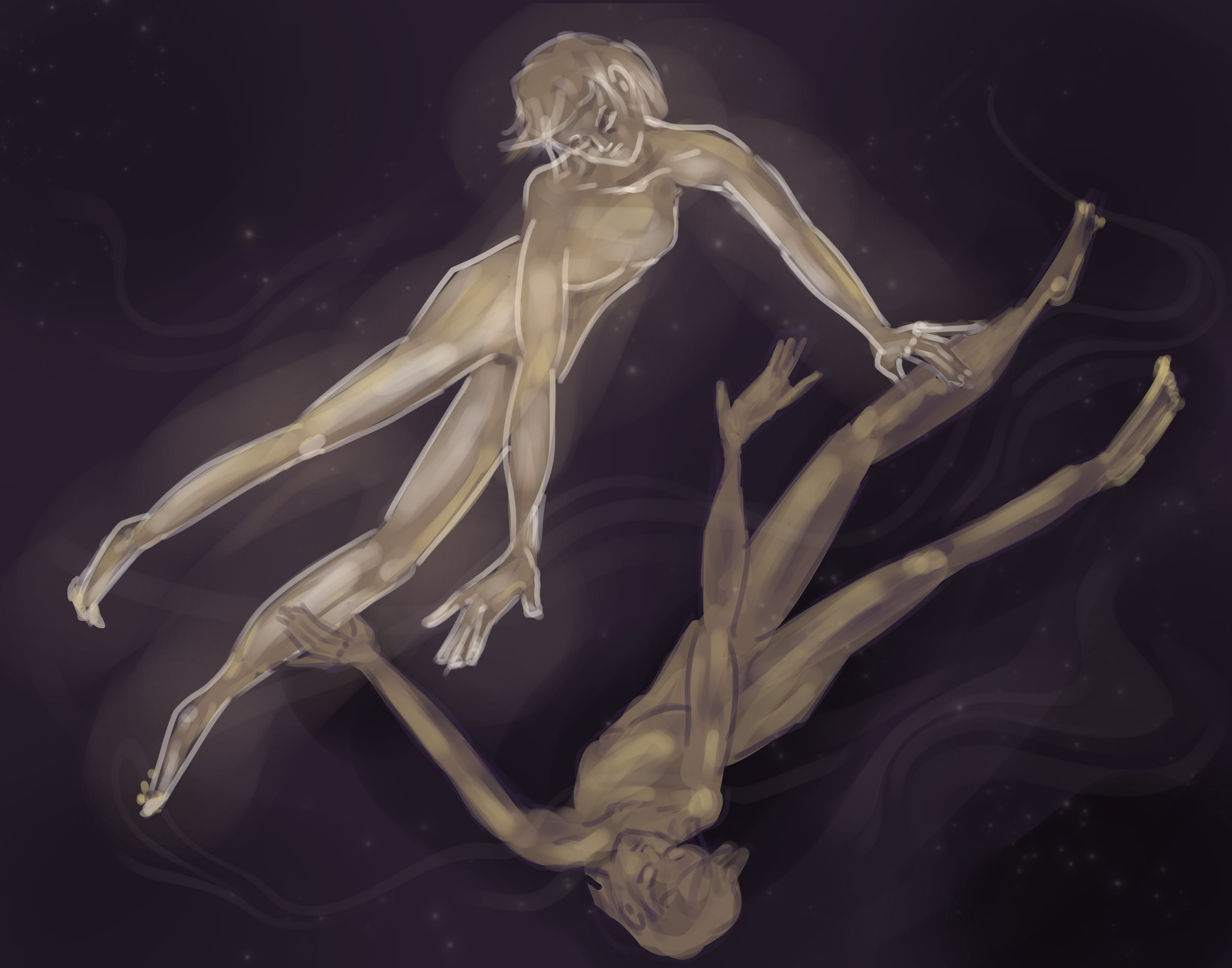
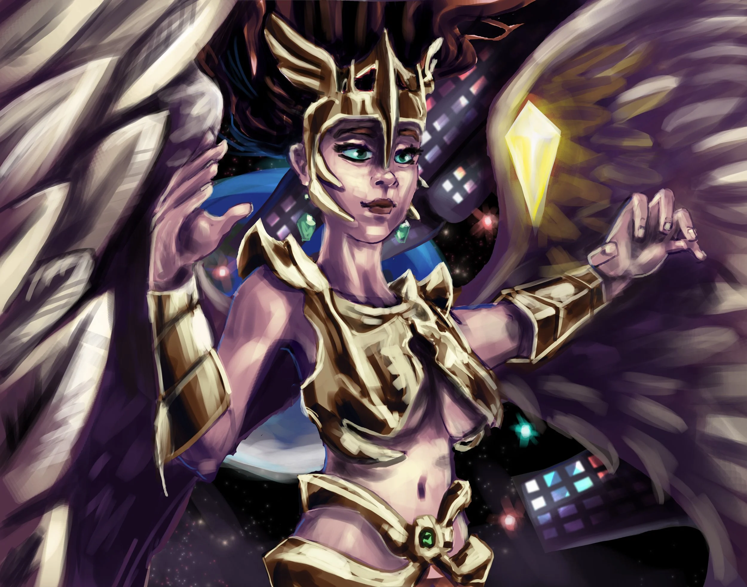
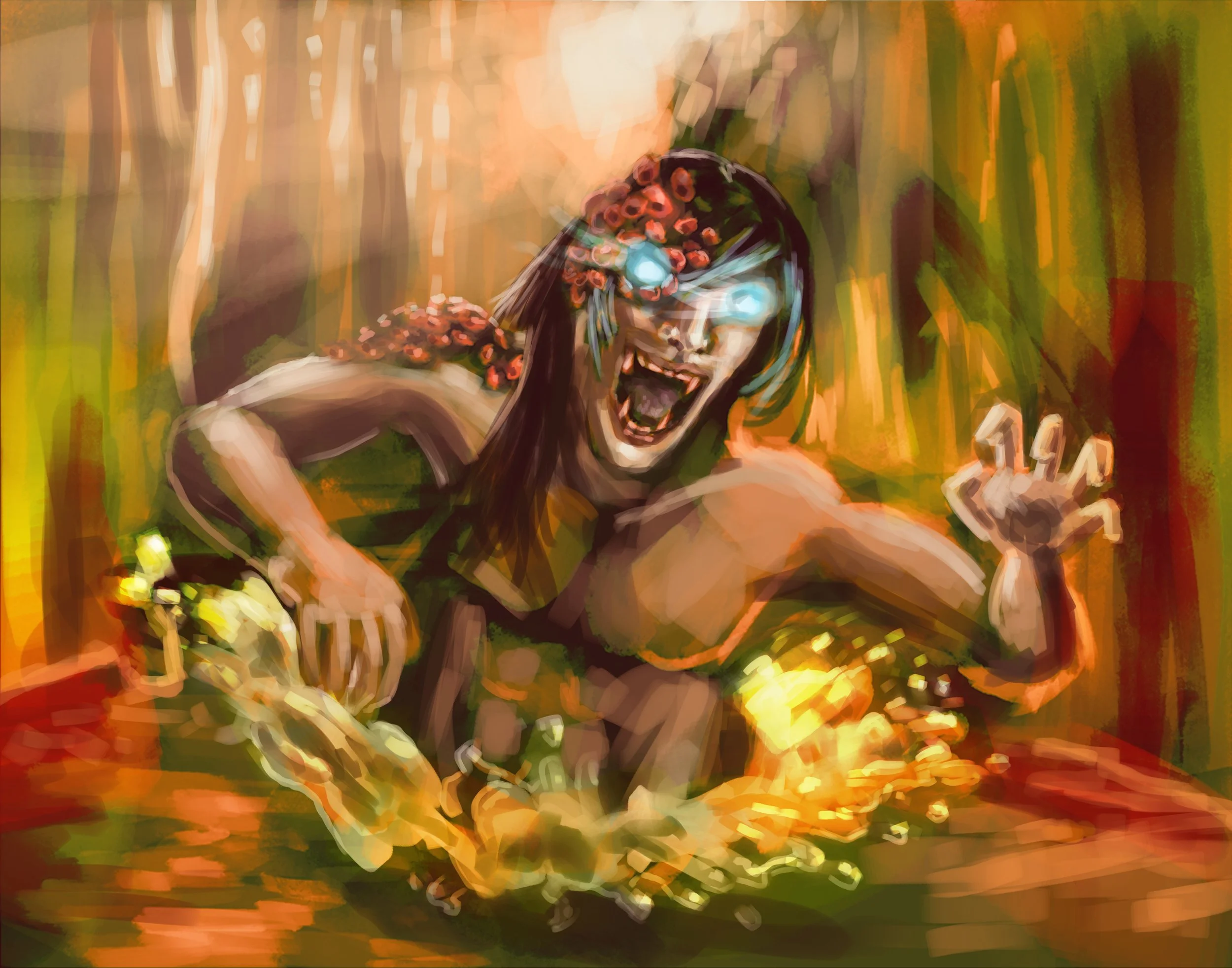
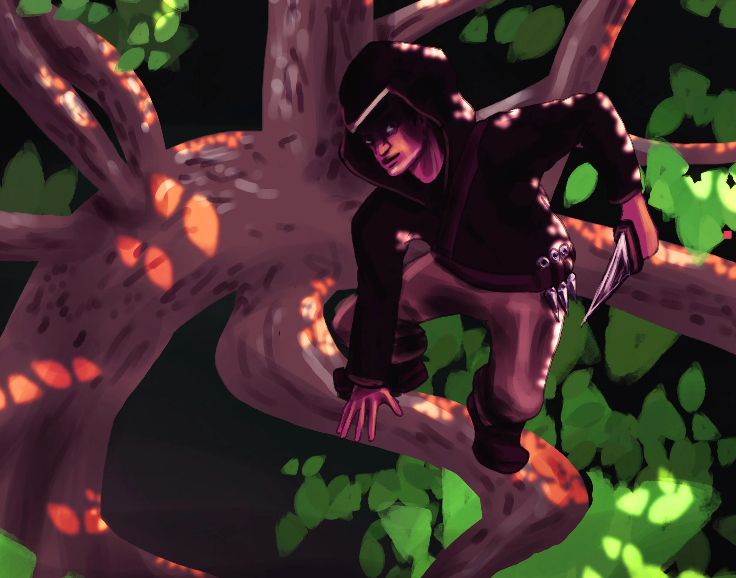
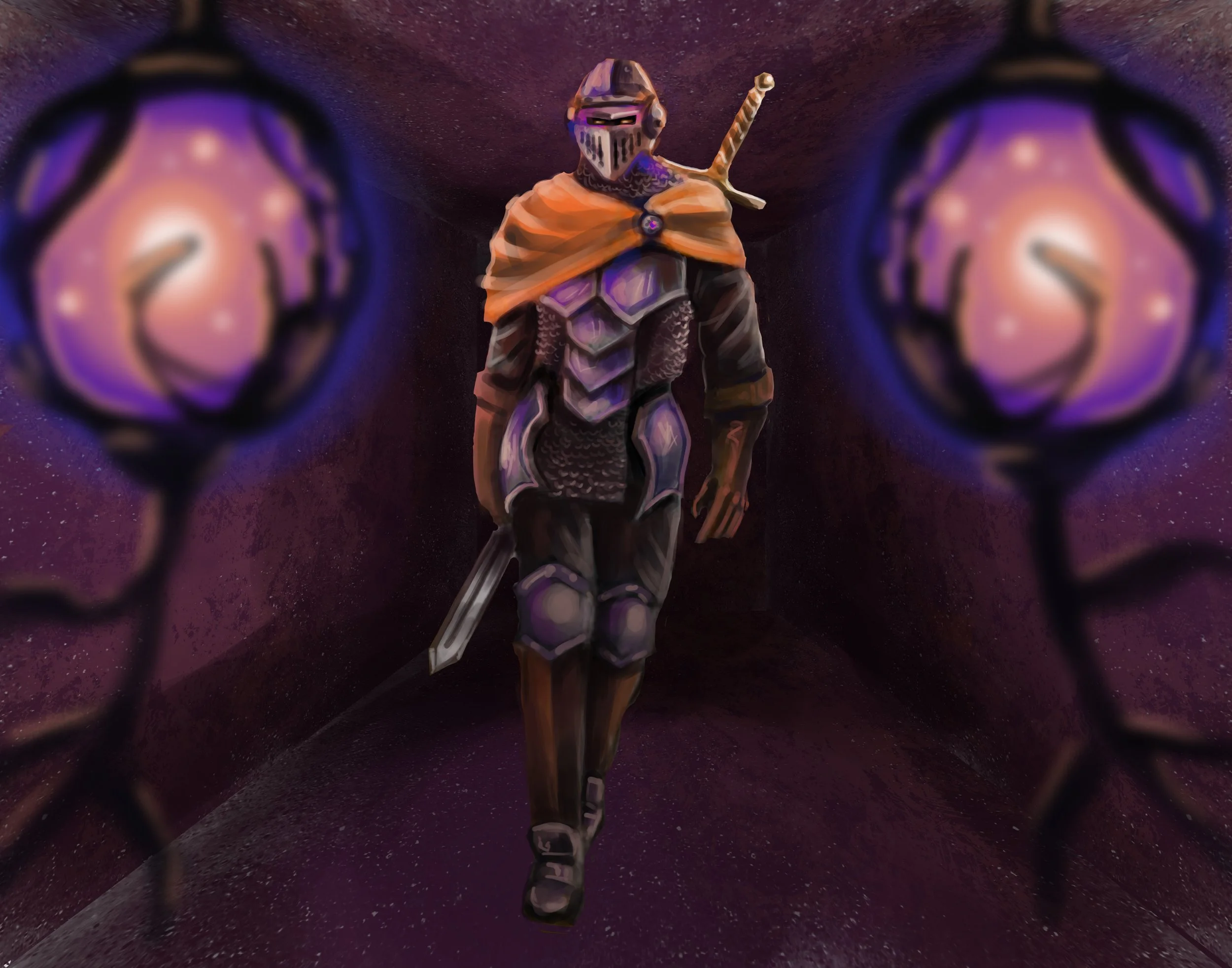
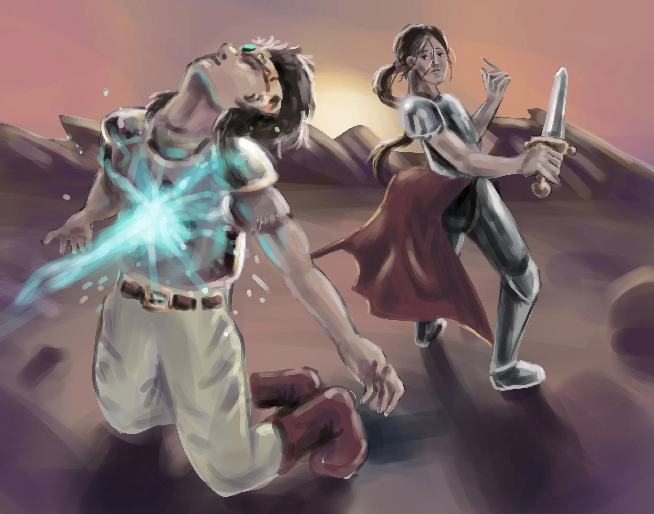
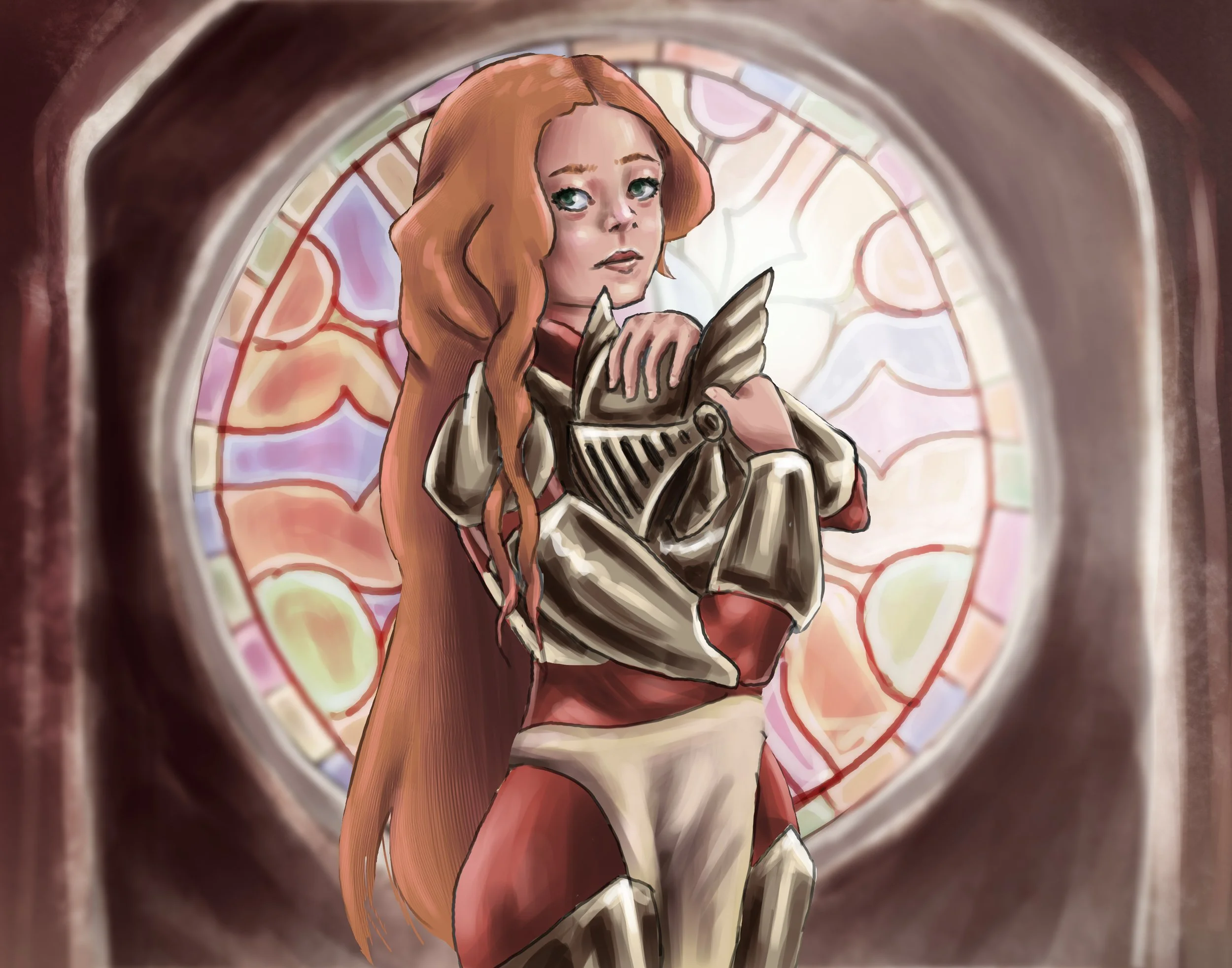
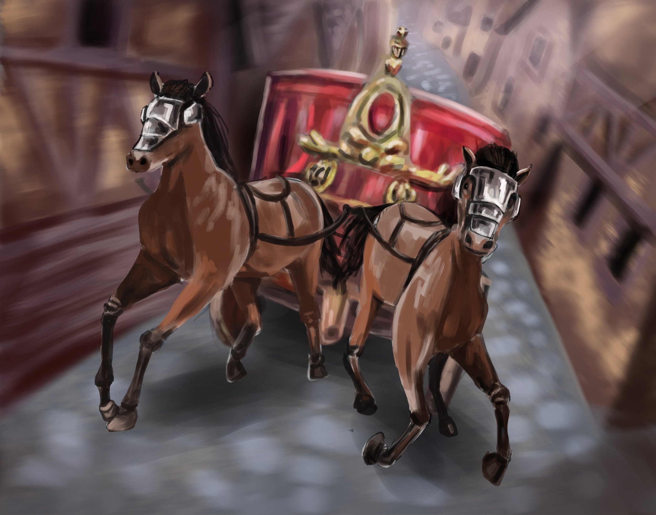
Human Card Illustrations
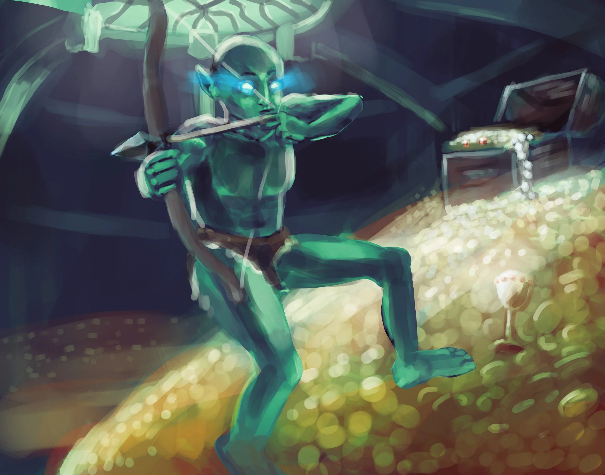
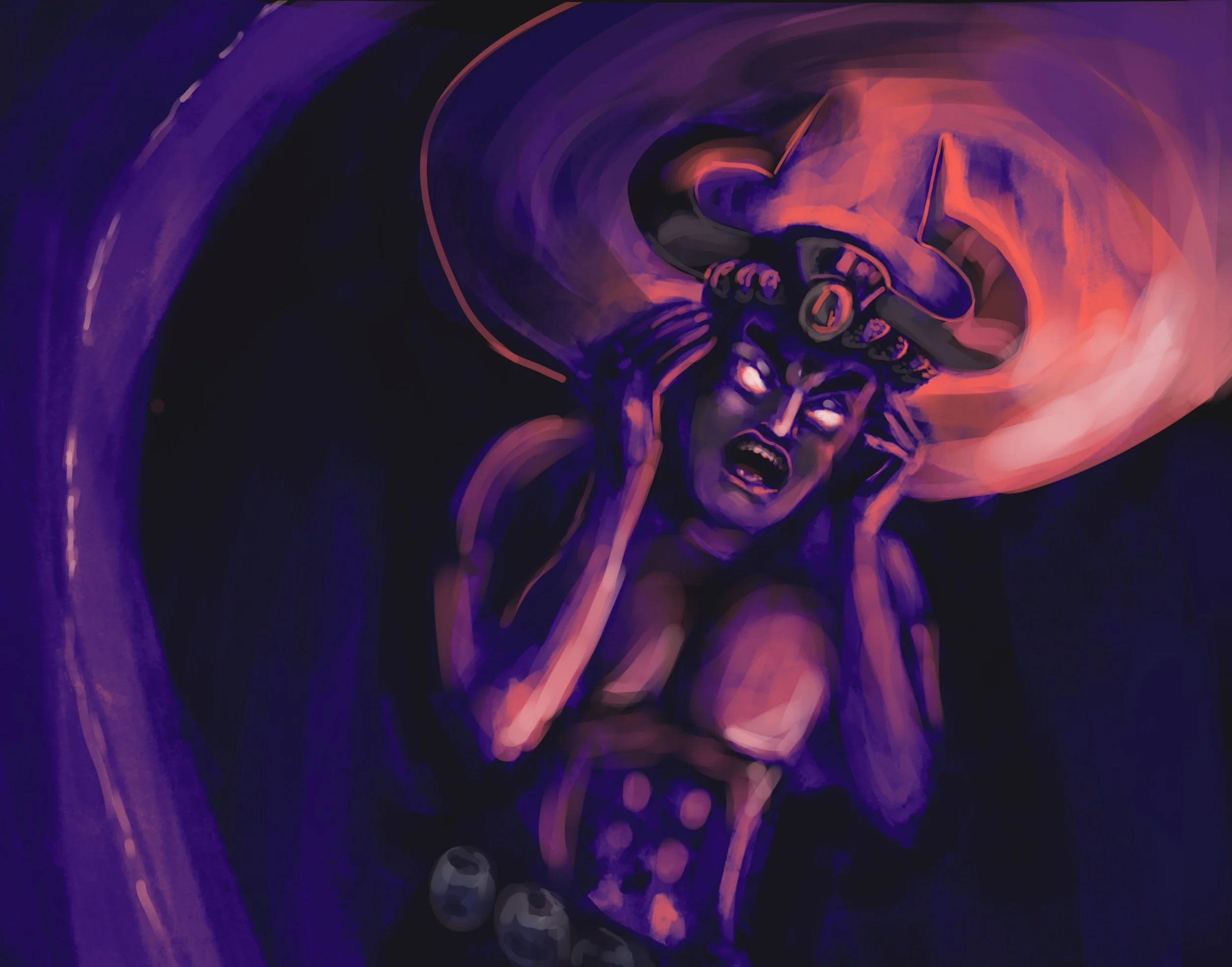
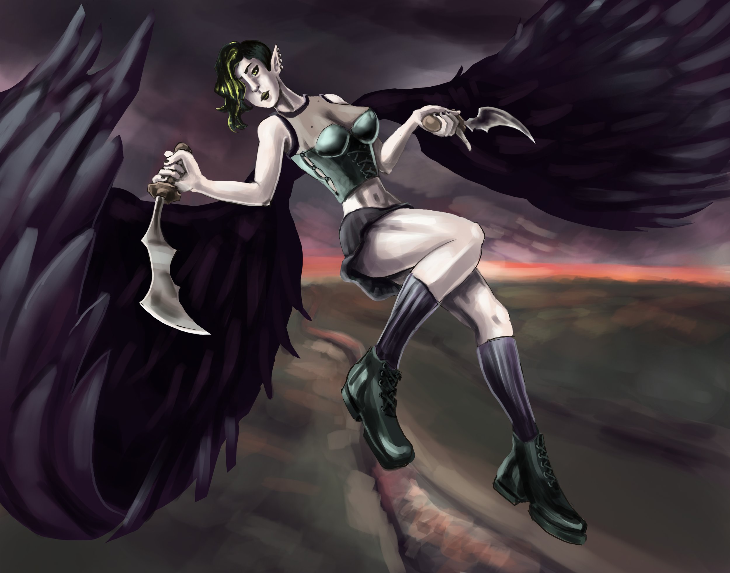
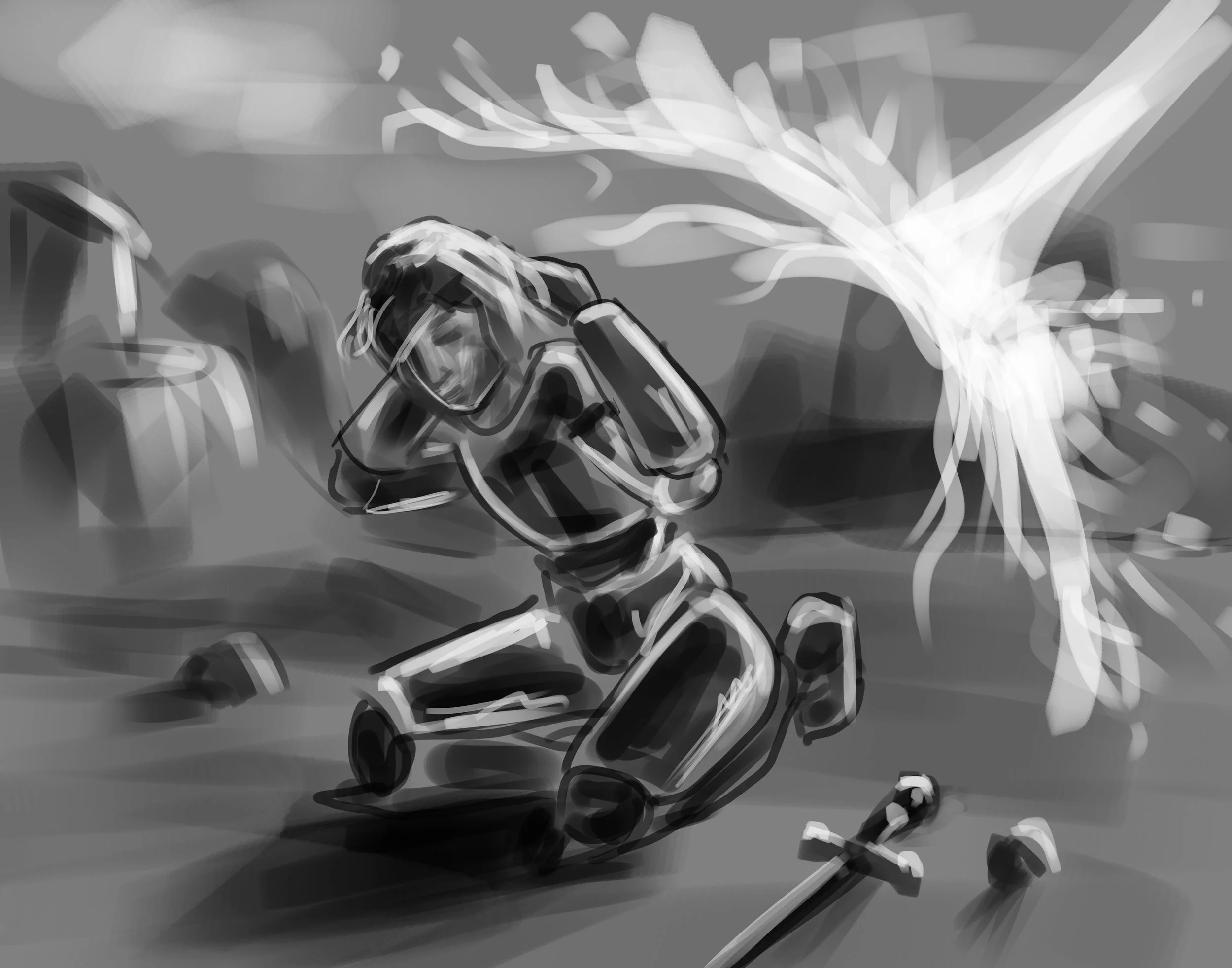
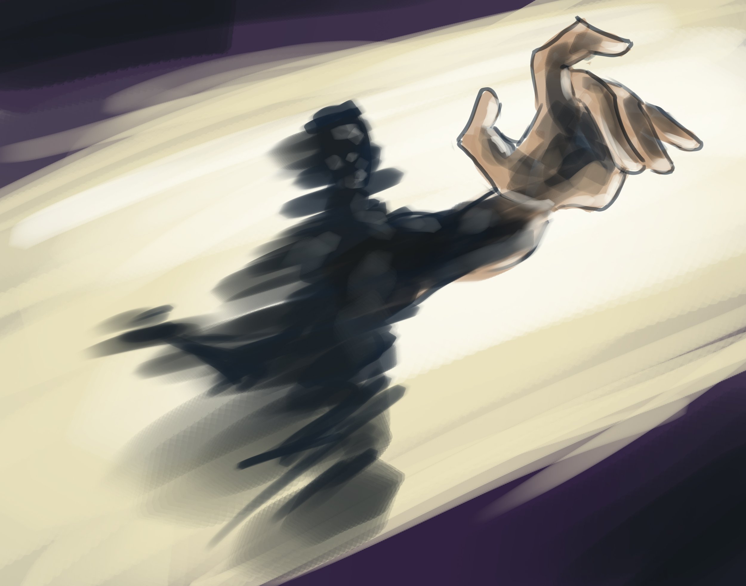
Wraith Card Illustrations